
About Lelism acts as the design practice and experimentation ground of Dimitris Lelakis. Dimitris is a cross-disciplinary designer with a background in architecture (MArch) and visual communication (MA), constructing visual and structural systems that possess coherent narratives. The practice’s research-based process - informed by the cultural landscape - explores the utilization of typographic language to create or expand visual scenarios, blending analog and digital formats across static and motion mediums. Awards/Distinctions International Creative Awards: Good cause award (2025), INTL International Poster Competition: 2x Jury commendations (2025), INTL International Poster Competition: Selection, Jury commendation (2024), Red Dot Design Award: Grand Prix (As part of the project team at P-SO) (2022), EBGE Greek Communication Design Awards: Poster award (2025), EBGE Greek Communication Design Awards: Leaflet-Program award (2025), EBGE Greek Communication Design Awards: Poster award (2023), EBGE Greek Communication Design Awards: Young designers award (2022), EBGE Greek Communication Design Awards: Experimental project merit (2025), EBGE Greek Communication Design Awards: Poster series finalist (2024), EBGE Greek Communication Design Awards: Experimental project finalist (2021), Museum of Typography: International poster competition 1st place award (2019), EBGE Greek Communication Design Awards: Exhibition graphics award (As part of the project team at P-SO) (2023) Publications INTL International Poster Book (2025), INTL International Poster Book (2024), Slanted Publishers: Experimental Type 03 (2024), NOIA Magazine: Absurd Rituals (2025), Code Crafted: Generative Design in Branding (2025), New Utilitarian: Systematic Approaches to Aesthetics and Design (As part of the project team at P-SO) (2023), Slanted Publishers: Experimental Type 01+02 (2022), Slanted Publishers: Posters Can Help (2023), Goethe-Institut: The Disappearing Wall (2020) Research Erratic Movement, Words and Images in Transit (2024), Unified System: Structures of Variable Use (2019), Architecture of Typography and Typography in Architecture (2018), A Manifest on the Act of non Creation (2025–) Working experience Post-Spectacular Office (OCT 2019–MAY 2023), Freelance Practice (2019–), Part of Temporal (2024) Education Master’s degree in visual communication @Vakalo Art & Design College, accredited by the University of Derby (Full scholarship issued by the Greek Communication Design Awards) (2023–2024), Master’s degree in architecture @University of Thessaly (2014–2020), Exchange program @Università Degli Studi di Cagliari (2017) FEATURES Another Graphic, Fonts in Use, Projektmono, Browsing Mode, Klikkenthéke, Minimal Gallery, International Assembly, Contemporary Type, Icographica, The Brand Identity, Bounty Hunters, Design Everywhere, Blank Posters, Kooollektoor, Goodfolios EXHIBITIONS International Assembly (2025), Sense of Wonder (2025), International Assembly (2024), toolkit Visual identity, brand language, research, art direction, editorial design, design systems, typographic systems, print design, motion design, digital design, spatial design, signage and way-finding, exhibition design, object design, campaign concept and implementation, 3D design, naming, packaging, photography
Last website archive Update ● 31 DEC 2025
CURENT DATE AND TIME 00:00:00
Collaborators Temporal-Practice with Juan Solano, Maria Tsilomitrou Project Type Film festival identity Client Thernon Short Film Festival Description Thernon (θερνόν) is a nomadic short film festival featuring mainly Greek directors that travels to remote locations, such as small vineyards, ancient ruins, and secret gardens. Inspired by the festival's constant movement and Odysseus' journey to Ithaca, Thernon's identity emphasizes topos, the locality of each place. ● The festival's title is written in Apla, an old Greek serif typeface commonly used for poetry publications in the Greek editorial industry over the past few decades, while the general description is written in Monument Grotesk, a sans serif typeface, highlighting the contrast between poetic locality and neutrality. Rows of blurry and noisy typography symbolize the essence of cinema, conveying the moving frames, the director's focused gaze, and the festival's movement from location to location. Lowercase letters represent the length of films showcased at the festival. In 2022, Thernon traveled to Ithaca and Aitoliko, two small islands in the south of Greece. To the South, and South again. Awards Greek Communication Design Awards: Poster (Award)
1

%20short%20film%20festival_ithaca_dimitris%20lelakis.webp)
%20short%20film%20festival_aitoliko_dimitris%20lelakis.webp)


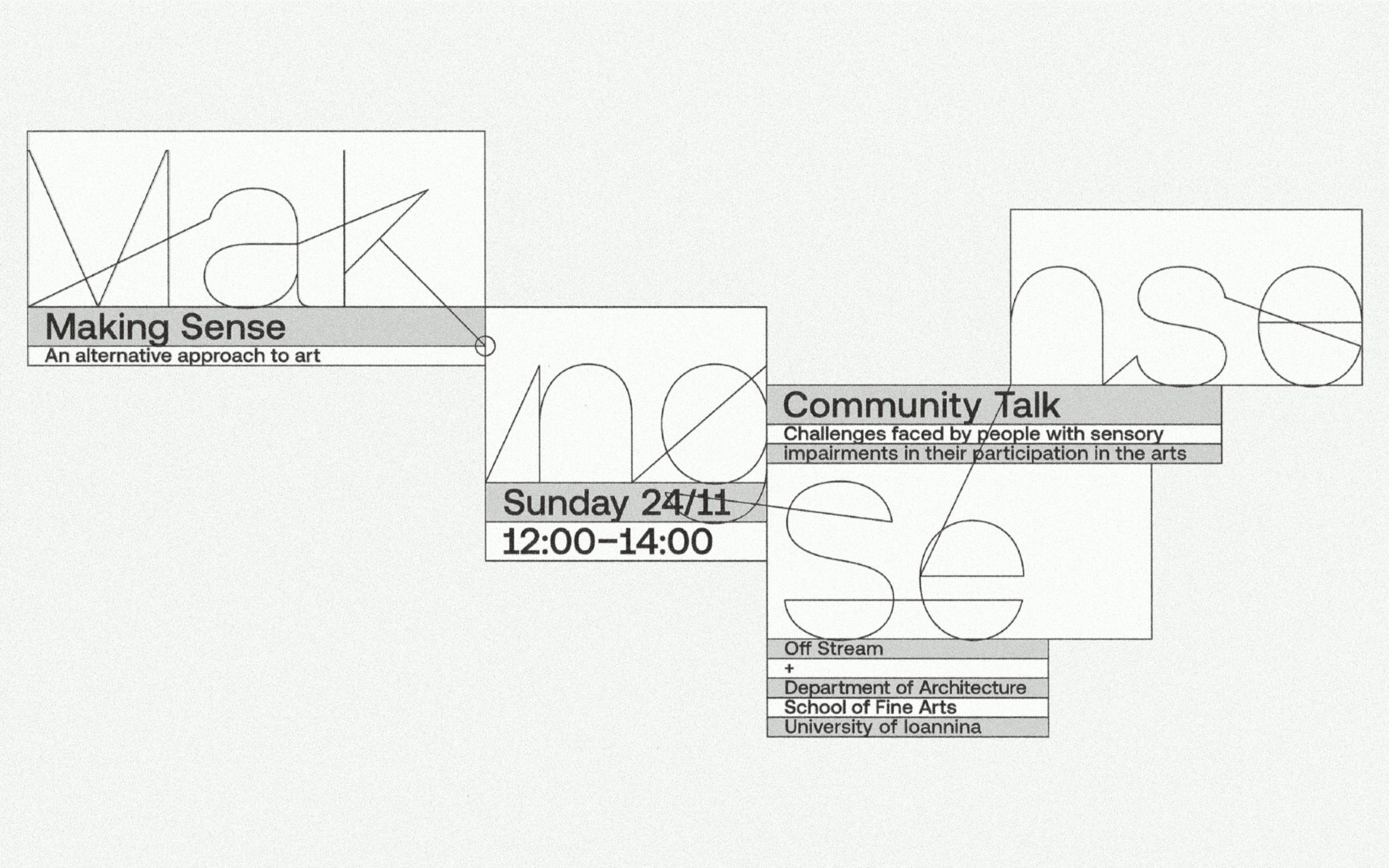
Collaborators Mariza Tsakona Project Type Visual identity Client Offsteam Description Off Stream in collaboration with the School of Fine Arts and the Department of Architecture of the University of Ioannina, organized the project Making Sense, a project that proposes a different approach to art. ● From November 22nd to December 1st, open discussions, workshops and experiential acts took place at the Papazogleios Weaving School and in selected locations in the city, aiming to enhance the equal inclusion of people with sensory impairments in both the enjoyment and creation of art. ● Making Sense calls for a rethinking of existing practices of creating and experiencing art, and proposes, through experimentation, new alternative structures and ideas. The visual communication of the series of events consists of a thread which, with a single stroke, creates new frames for each graphic application - territories of possibilities that embrace the content at hand while simultaneously synthesizing it. ● A parallel requirement for the creation of the fundamental application of the poster-program is the existence of a dynamic communication system that changes form for each horizontal or vertical - analog or digital format for which it is intended, offering the possibility of alternating according to the information available. Awards Greek Communication Design Awards: Leaflet-Program (Award)
1


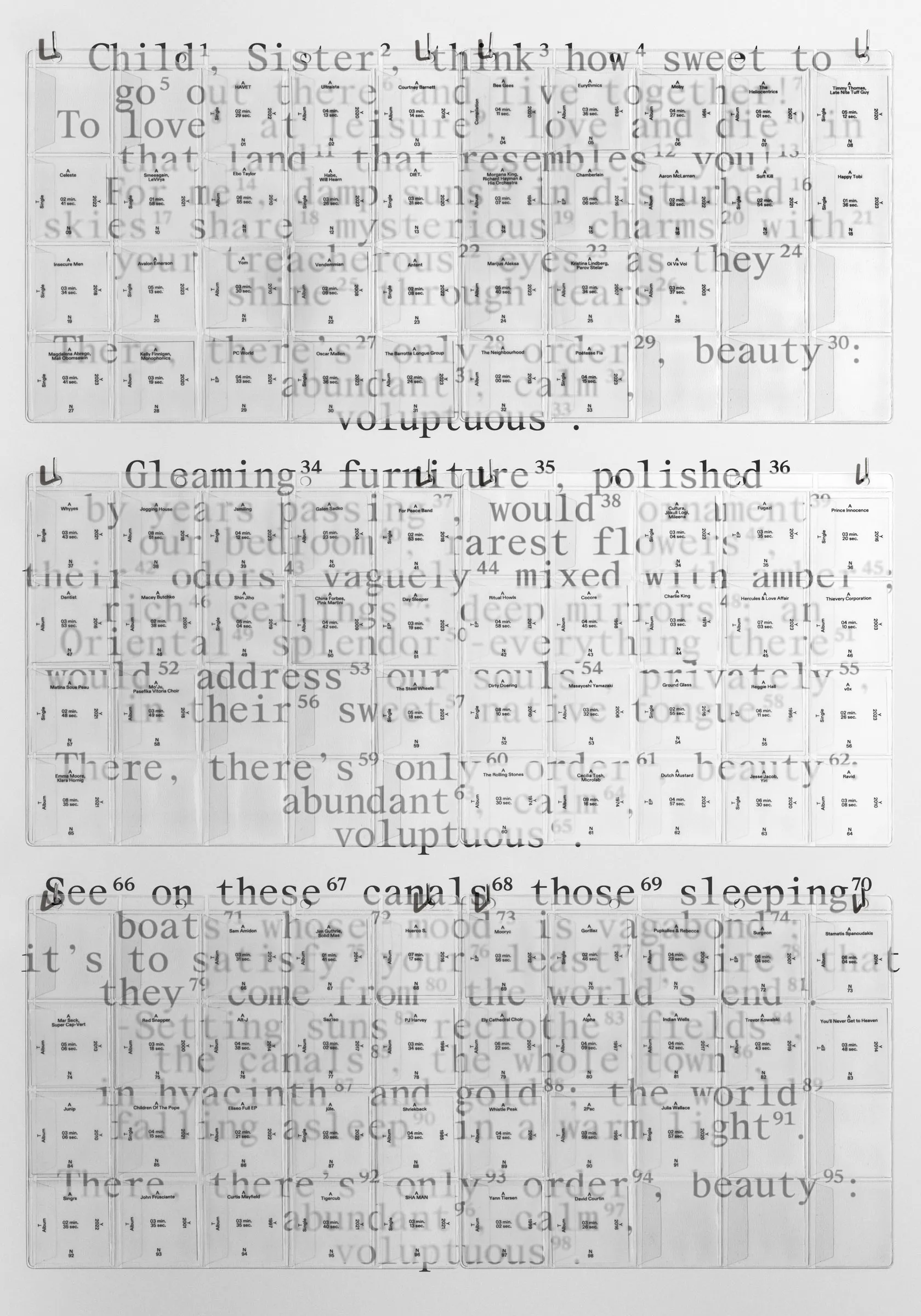
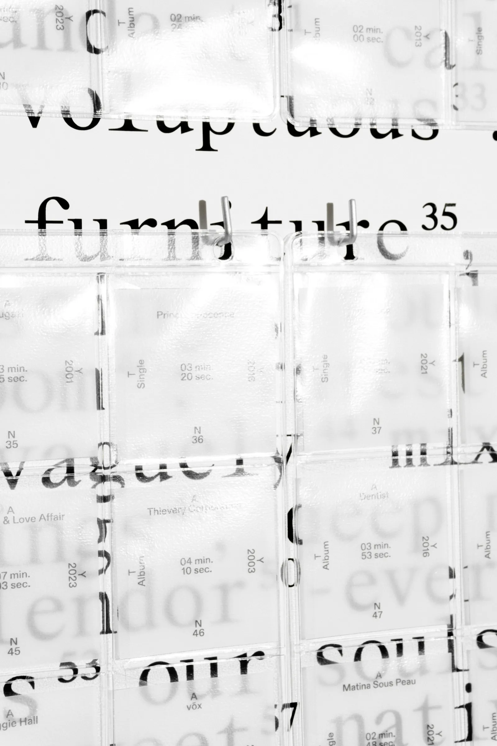
Collaborators Athanasios Katsougiannis Project Type Poster, Interactive Installation Description Acoustic Poem is a mixed media interactive poster installation that provides an alternative visual and audio representation of the poem "Invitation to the Voyage" by Charles Baudelaire (1821-1867). Baudelaire's poem transformed into an invitation to a new journey through sounds and images. ● The poster acts as a translation machine - transforming the written word into a multidimensional entity, embodying the idea that in a vast, continuously moving digital world with immeasurable possibilities, the potentiality for navigation and understanding is also infinite. ● The poem is divided into 98 sections, each assigned a sound or song that faithfully represents its essence. A custom-made algorithm illuminates and recognizes the length of each of the segments, and plays a unique part of the corresponding song for every new iteration, based on the calculated time, providing endless representations of the poem. The original poem becomes unintelligible. Words are listed on top of each other, with information and traces of the songs - other than their titles - creating a complex, layered reading that is taken off the paper, broken down, and reassembled. DISTINCTIONS International Poster Competition 2024: Selection (Jury commendation), Greek Communication Design Awards: Experimental project (Merit)
1


Collaborators Maria Tsilomitrou, Yun Kuo Project Type Visual identity system Client Inform Architecture Description Inform is a newly established architecture studio. Their identity consists of a constantly changing system, which highlights the relationship between form and architecture. A form is a starting point of an idea. It can function as a surface, as a volume, or as a boundary. In this identity, forms represent the relationship between positive-negative, shadow-light, transparency-opaqueness, black-white. ● Like in architecture, a building can be influenced by its environment and its attributes, inform architectures' identity can be affected by the format and the content. A balance between restrictions and simple human-made choices. Format affects the grid, content affects the number of points, points affect the form - and vice versa. ● For each application, we define the parameters such as grid and content. These elements are input to a specially designed algorithm, which produces a finite number of forms (output). These forms in combination with the content produce a different result each time. ● The typographic system is directly linked to the generated form and can influence and be influenced by it. The typeface aims to communicate an archival-programmatic feel -which monospaced fonts often give- but without being too literal, trying to include the human factor in the process. Inform is a constantly evolving system of form, content and typography.
1


Creative Direction Post-Spectacular Office Project Type Editorial Client Archisearch.gr Description Archisearch the Paper Edition is a bi-annual printed publication dedicated to the architecture and design scene. In the large format of the paper, a dynamic yet strict system allows typography, photography, and imagery to constantly change roles, ranging from expressive means to utilitarian information. In each issue, microsystems create new varying atmospheres. ● The covers maintain some elements across the publications as a means to a level of uniformity, yet they employ different concepts of indexes as information design that derive from the content of each issue. The project was created under the direction, with and for Post-Spectacular Office. Project Team Awards Red Dot Award: Grand Prix
1


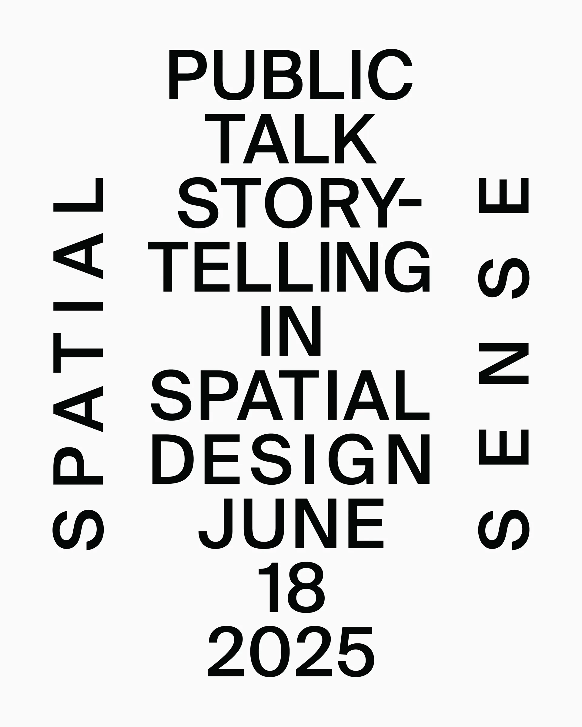
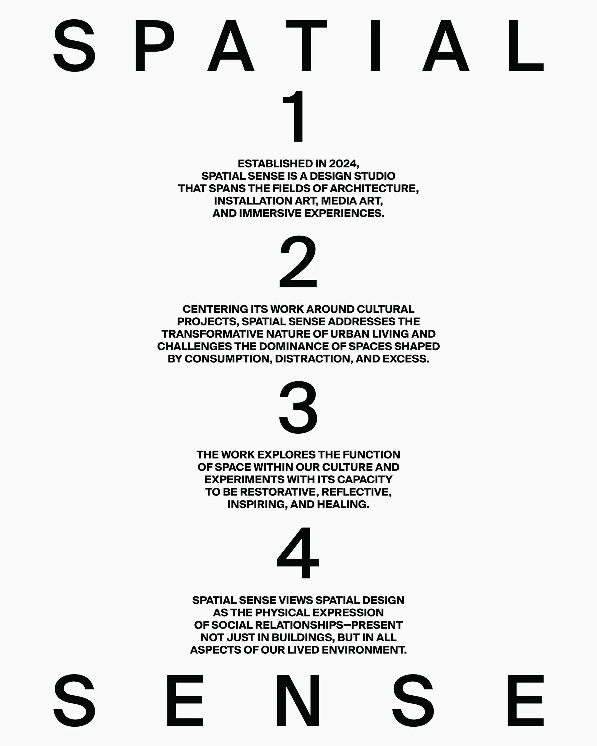
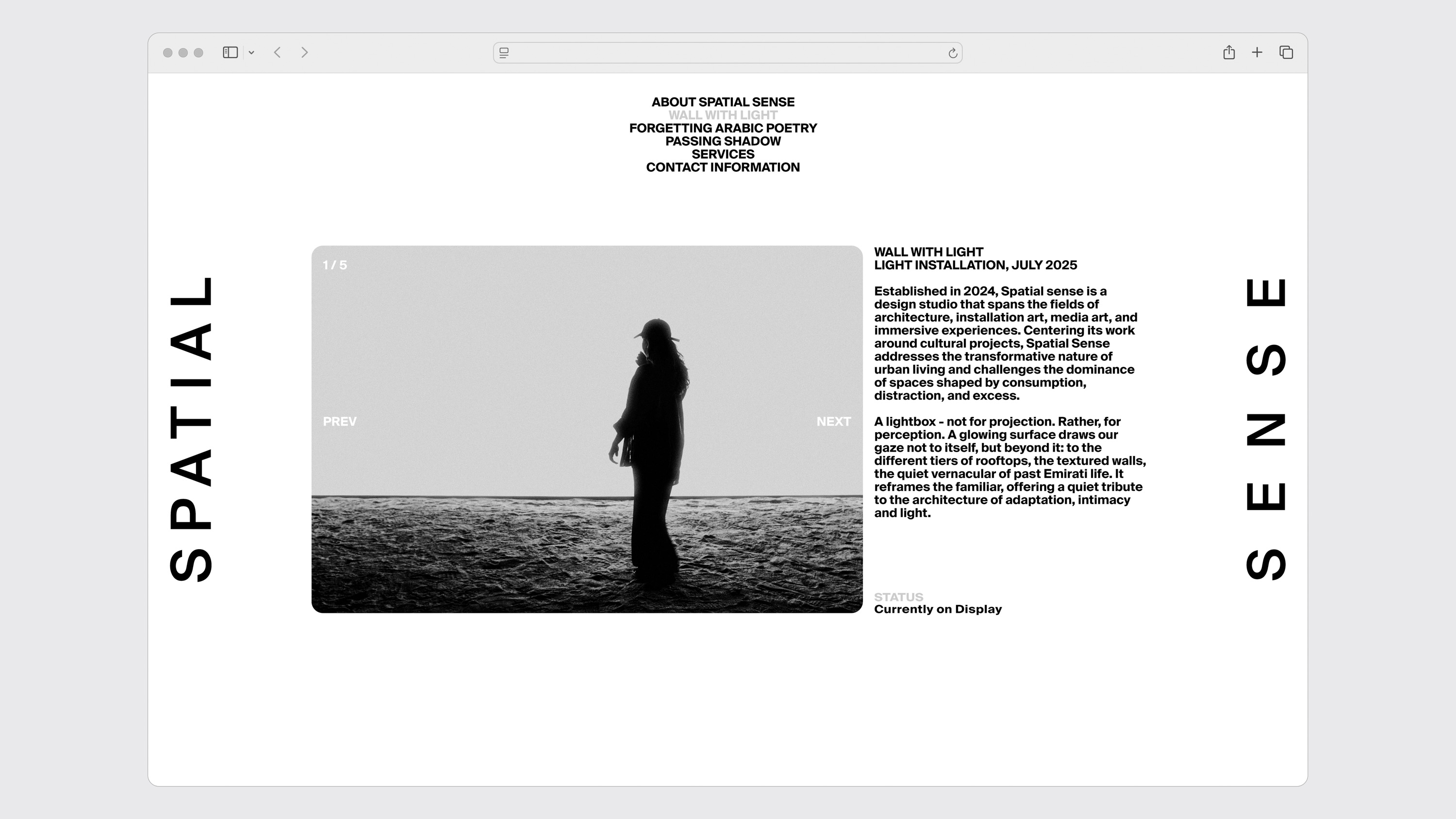
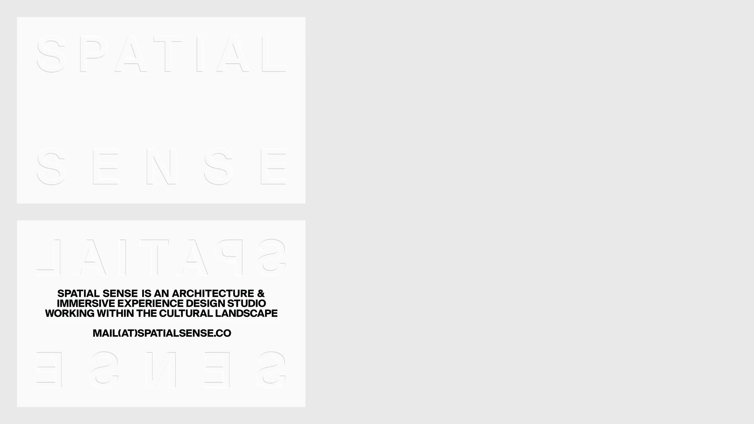
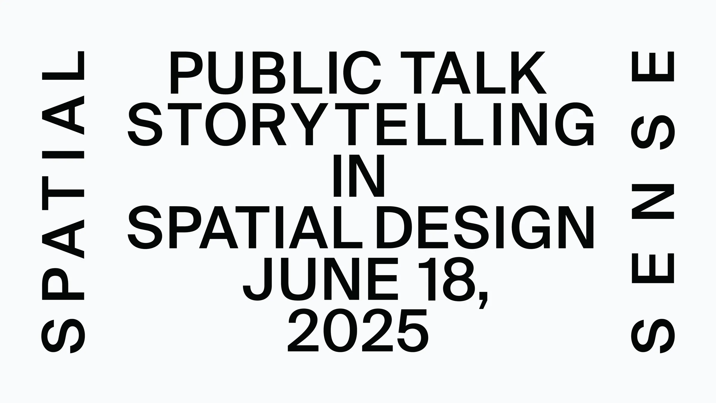
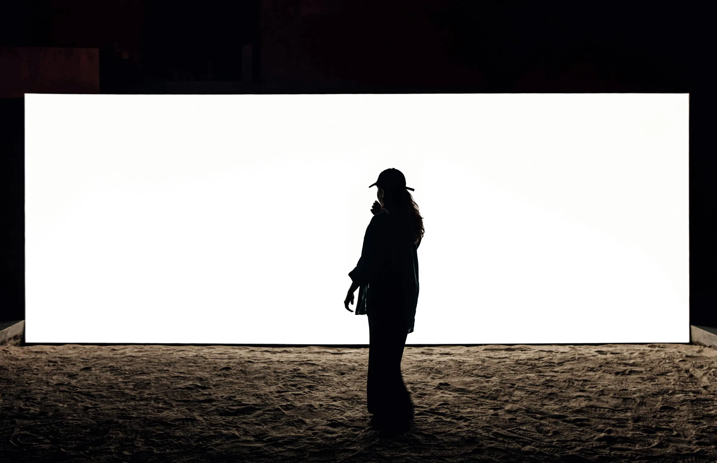
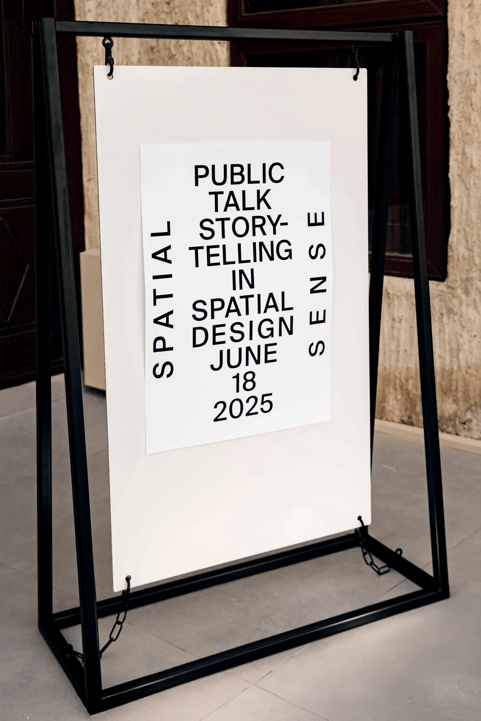
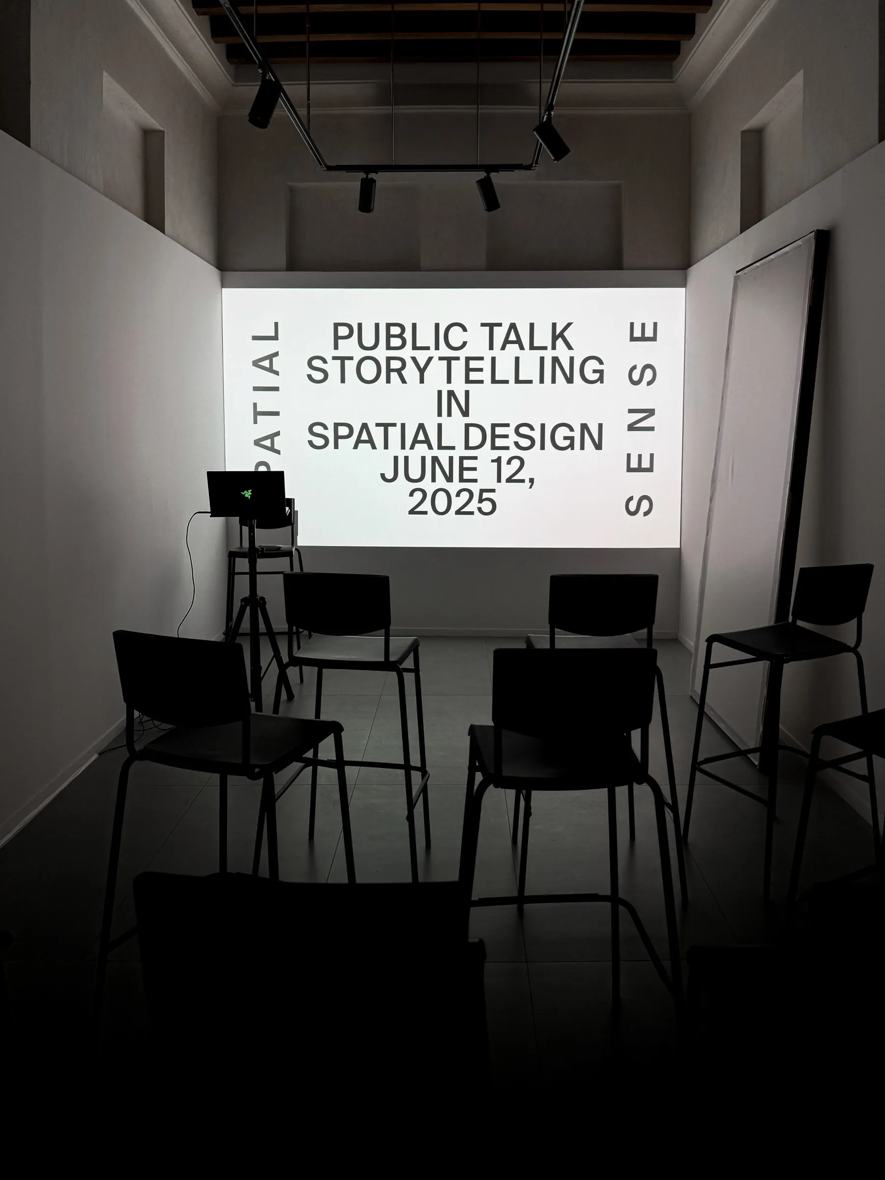
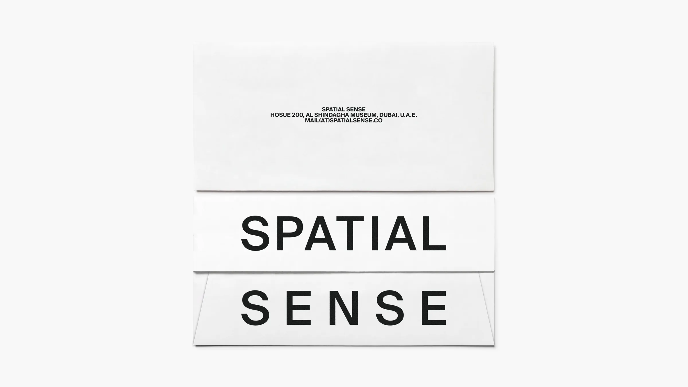
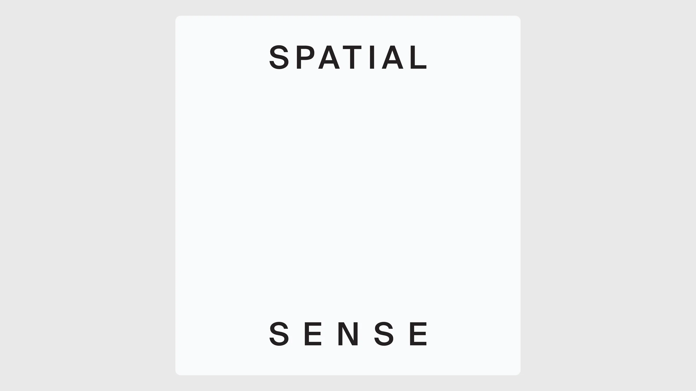
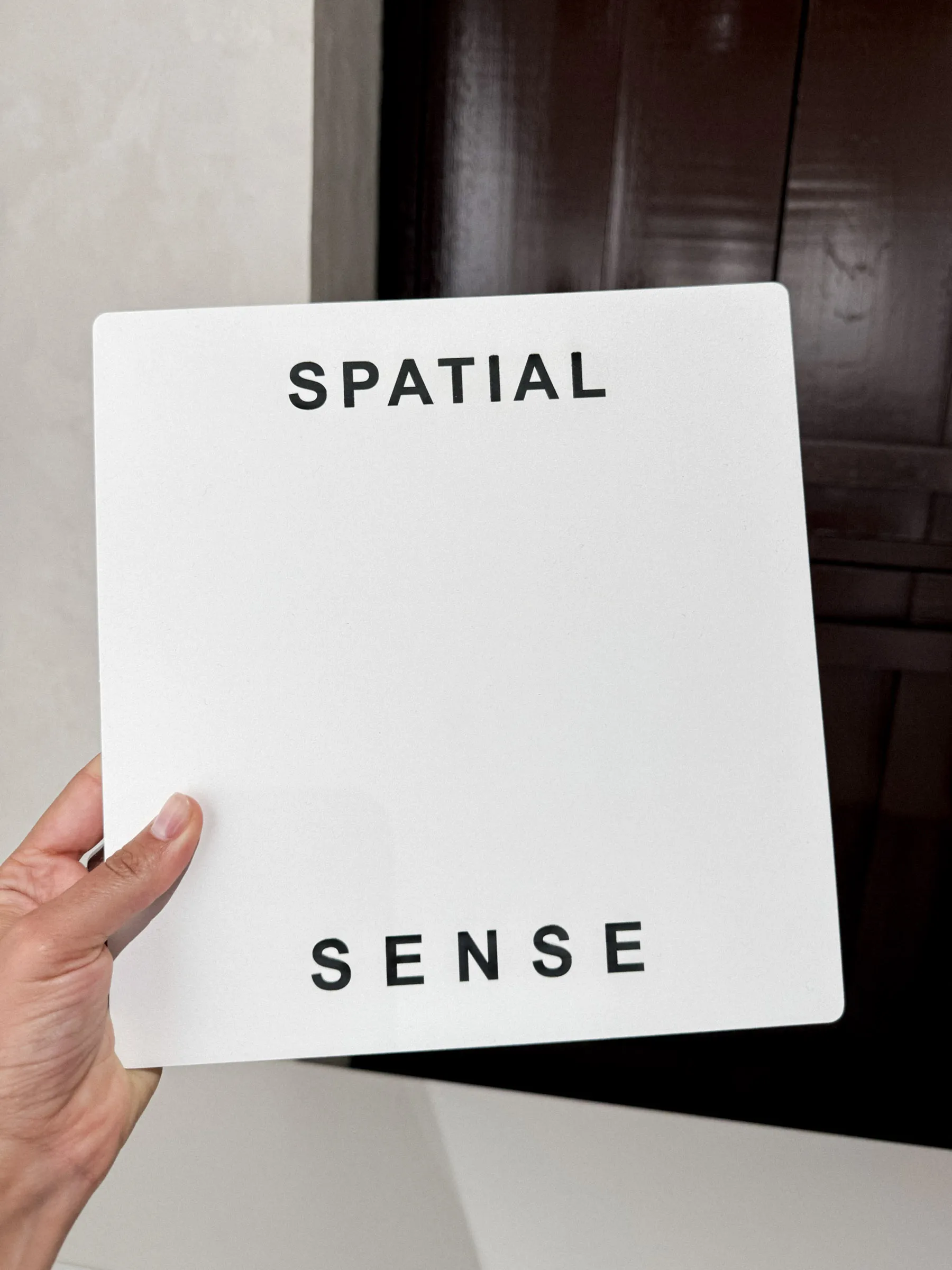
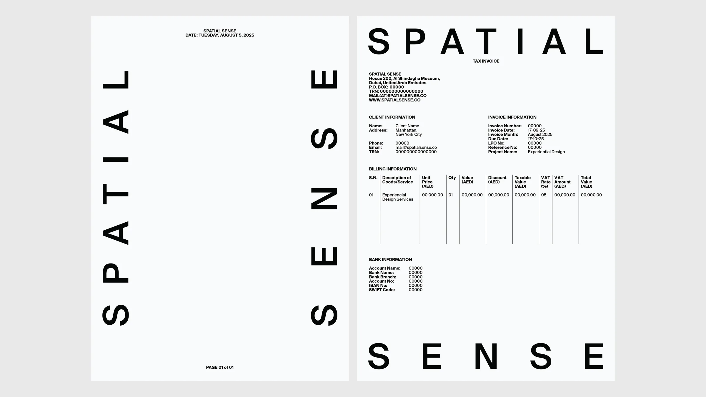
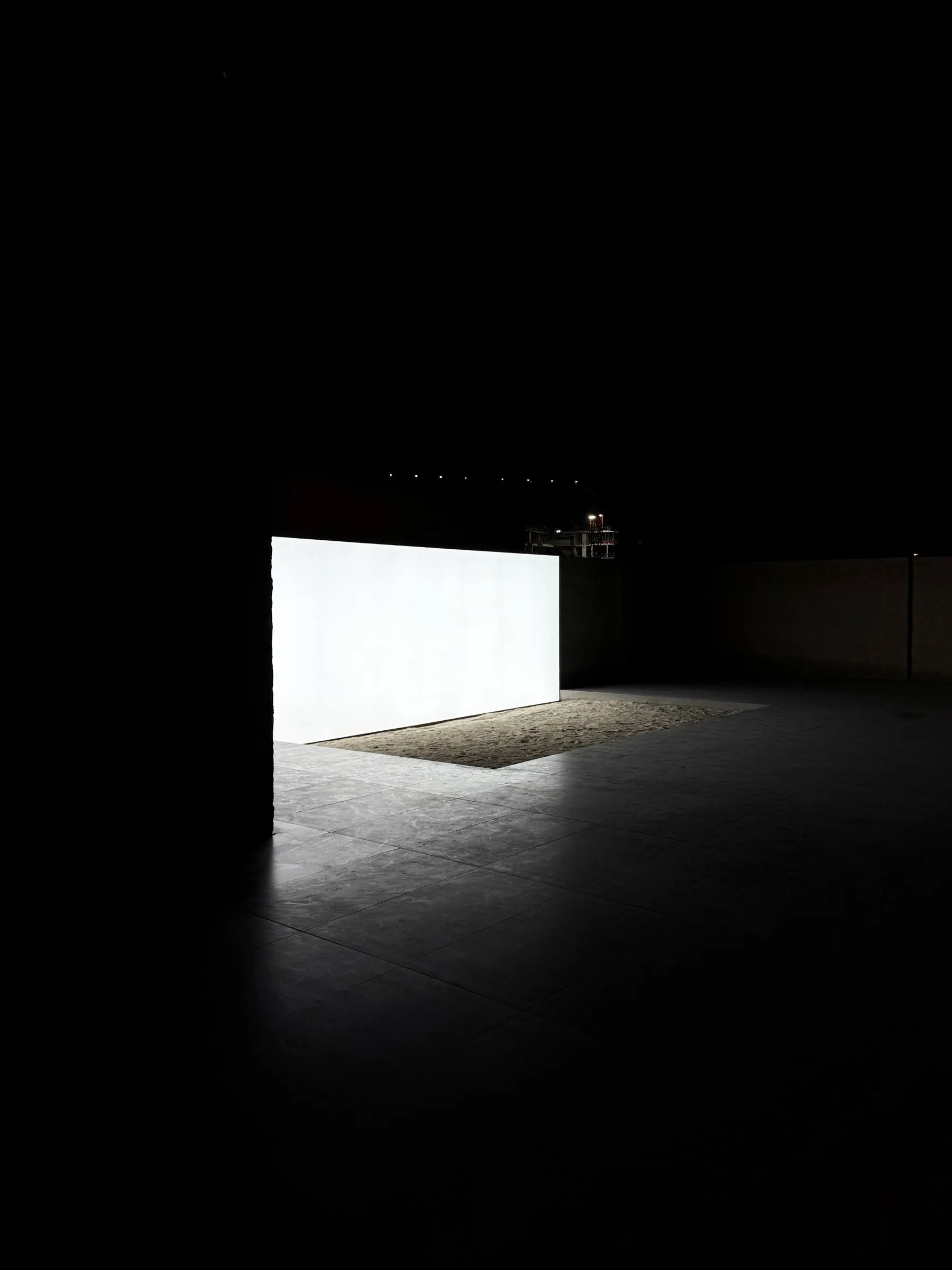
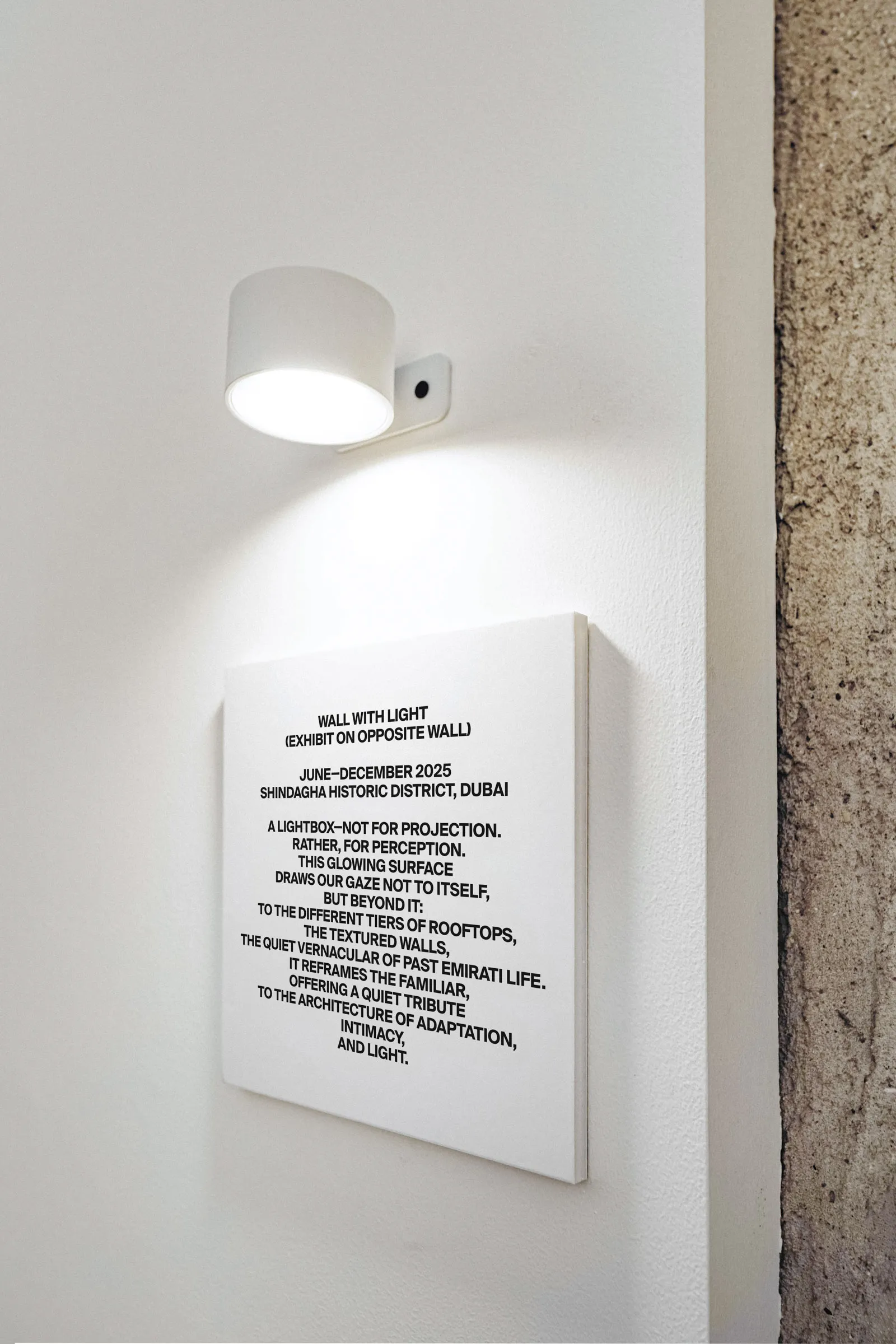
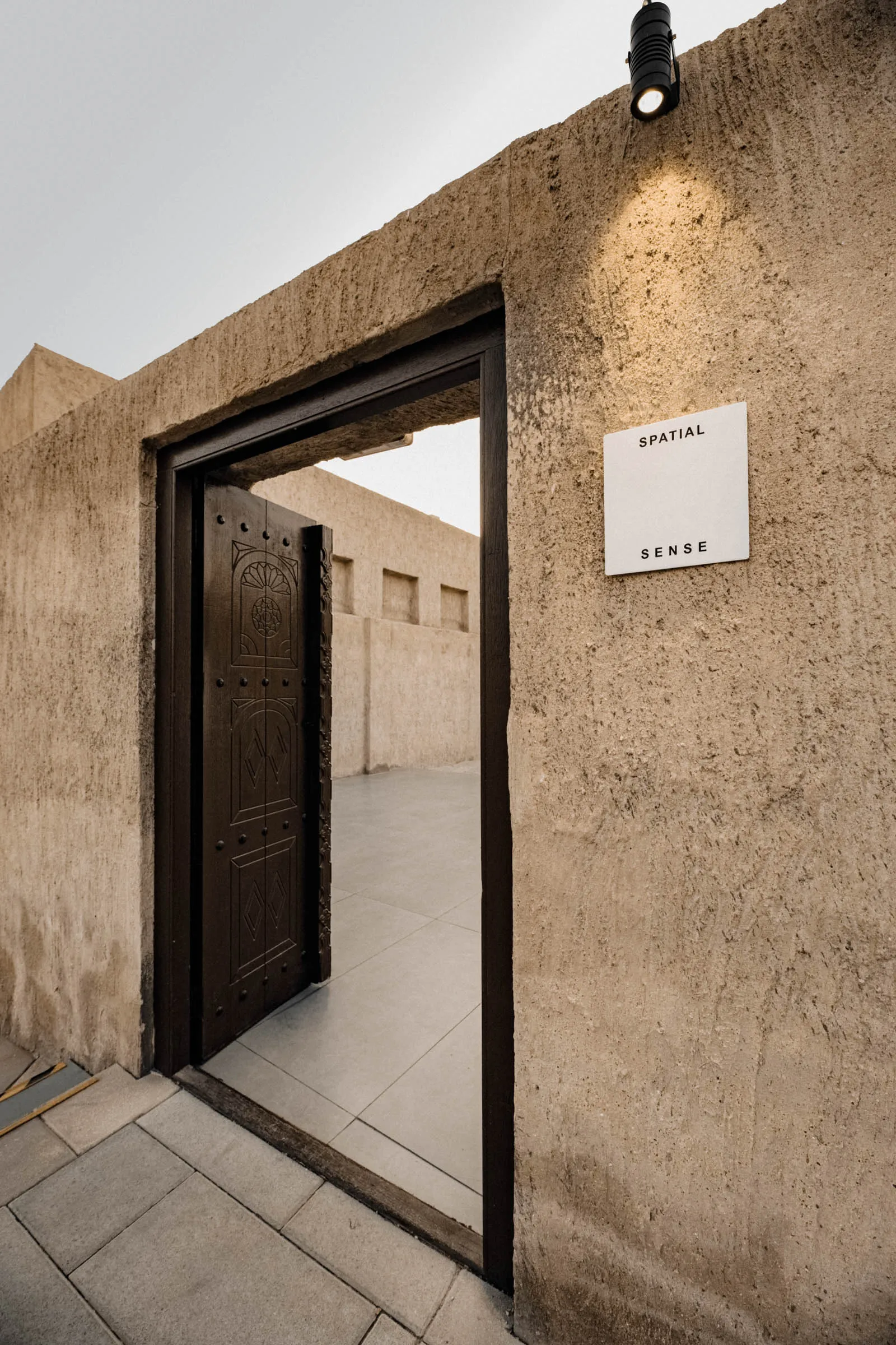
Project Type Visual identity system Client Spatial Sense Description Spatial Sense is a design studio that spans the fields of architecture, installation art, media art, and immersive experiences. ● The two words act as thresholds. They function as doors, opening to a space of possibilities. Sometimes this space is filled with words; sometimes it stands empty. ● The system is implimented in various printed, spatial and digital formats.
1


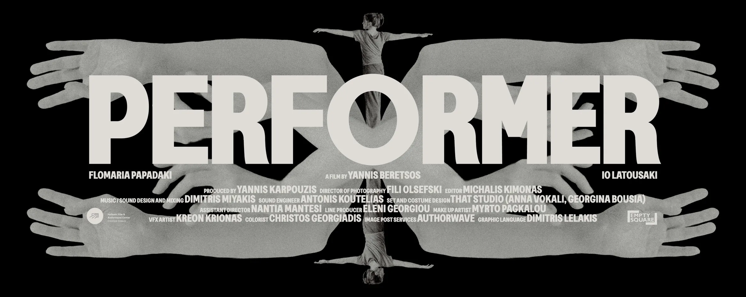
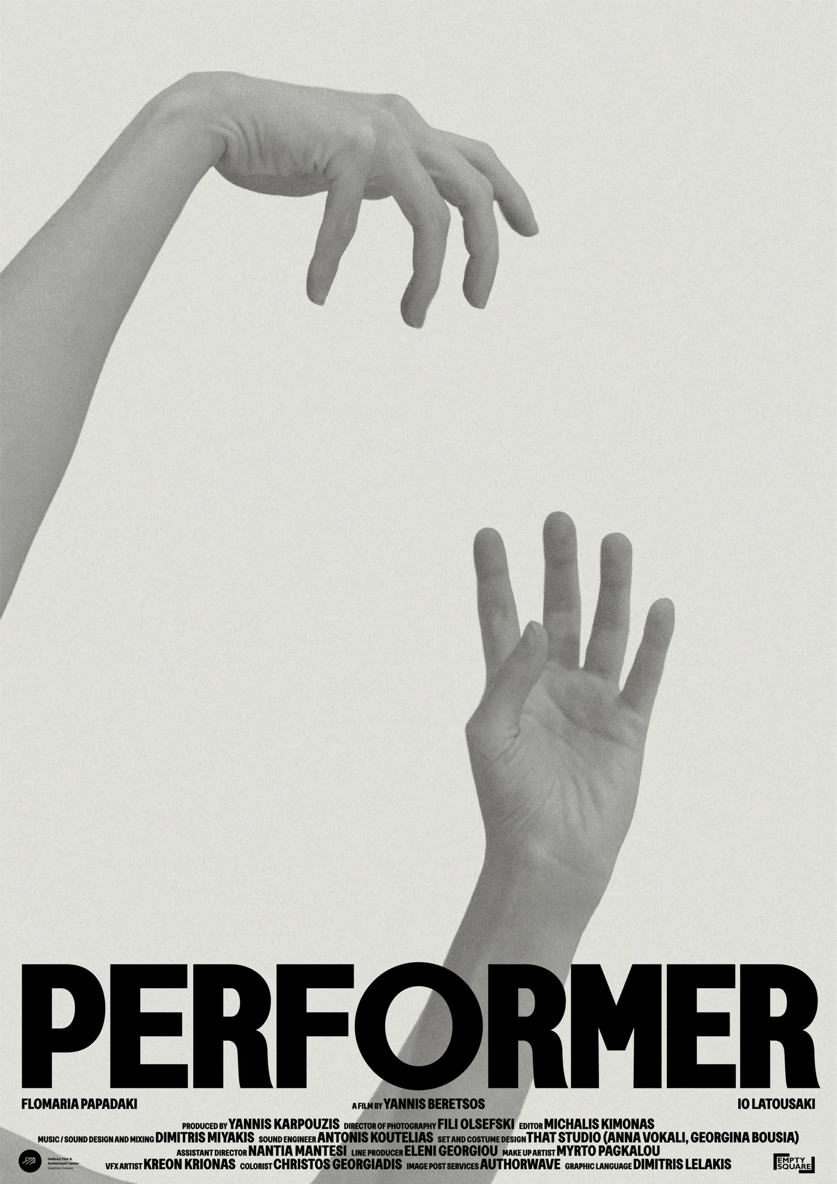
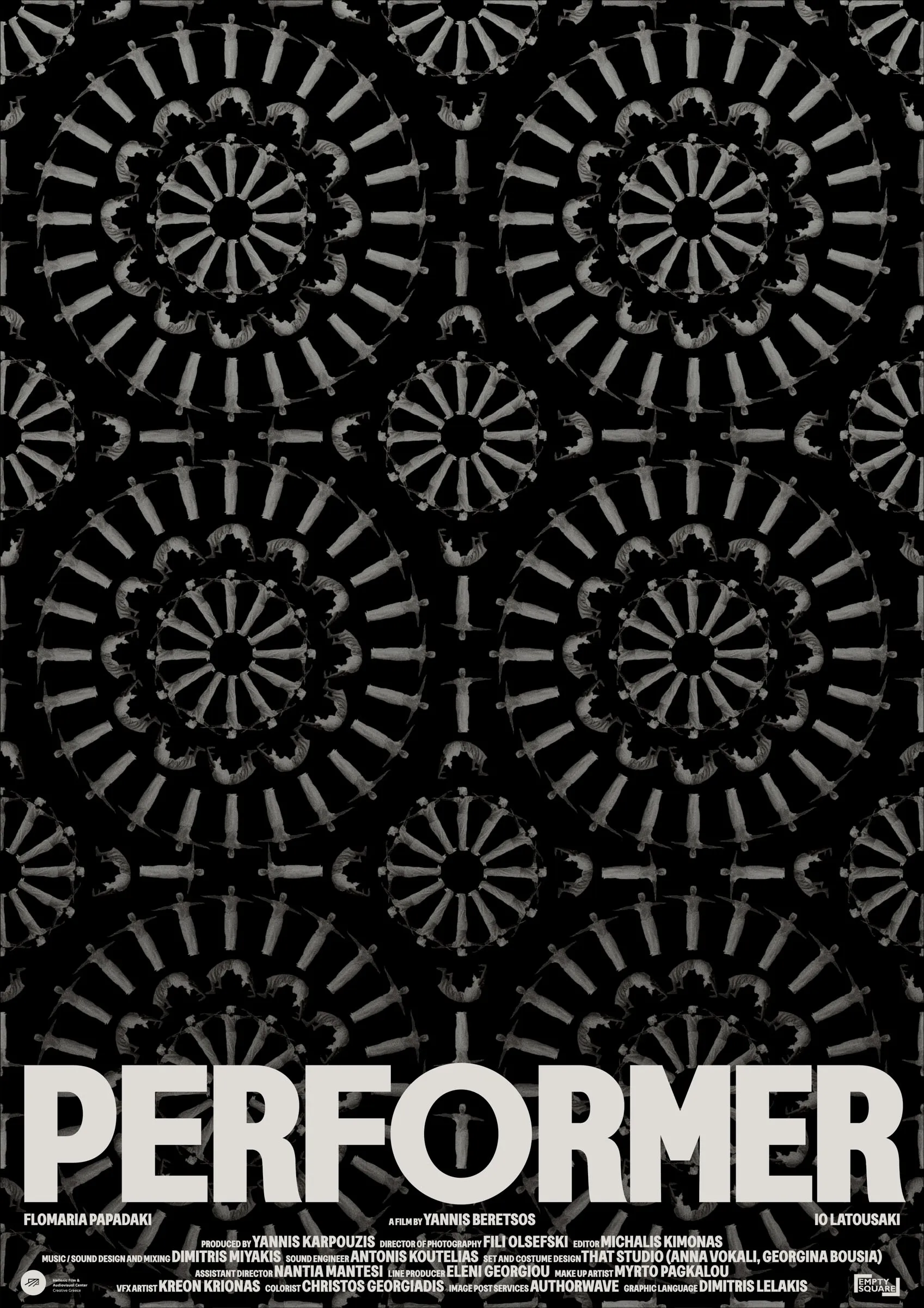
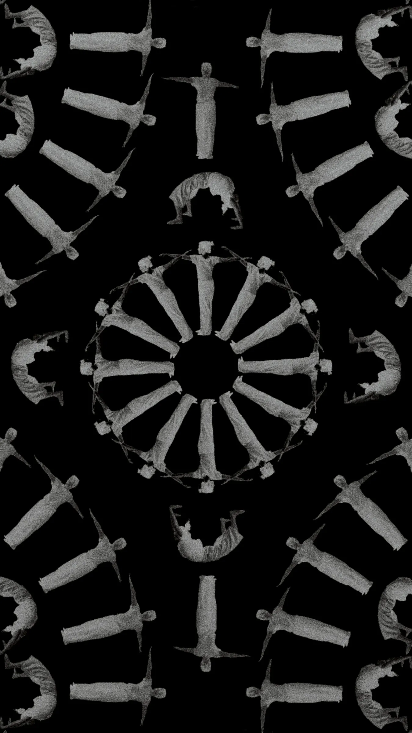
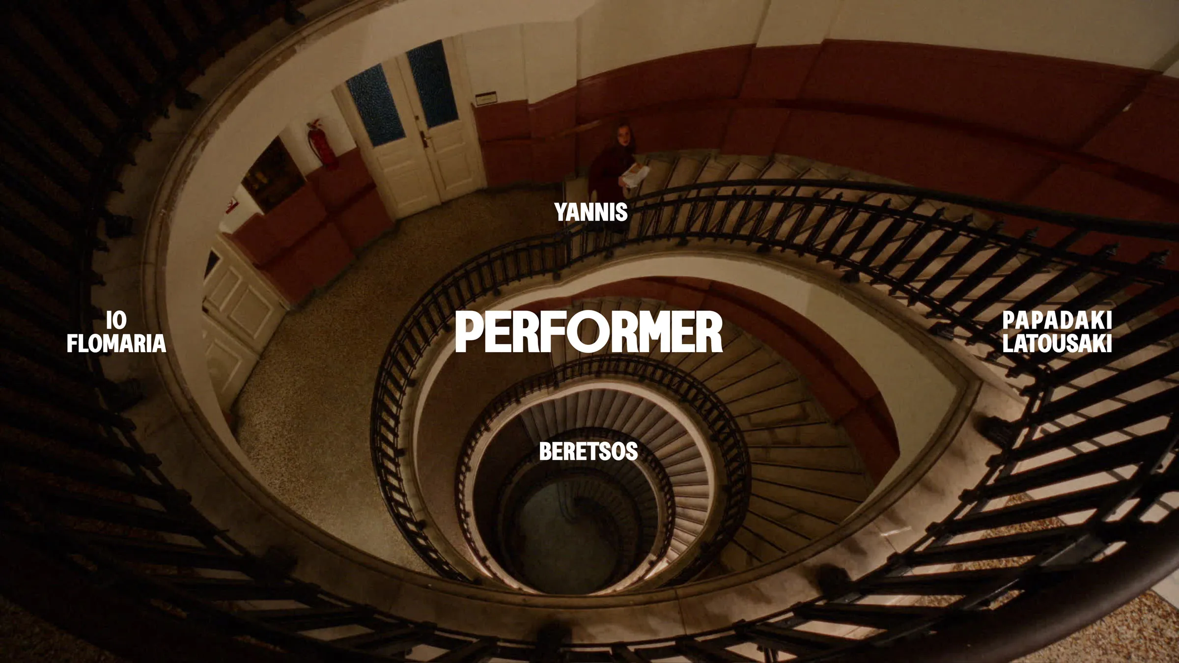
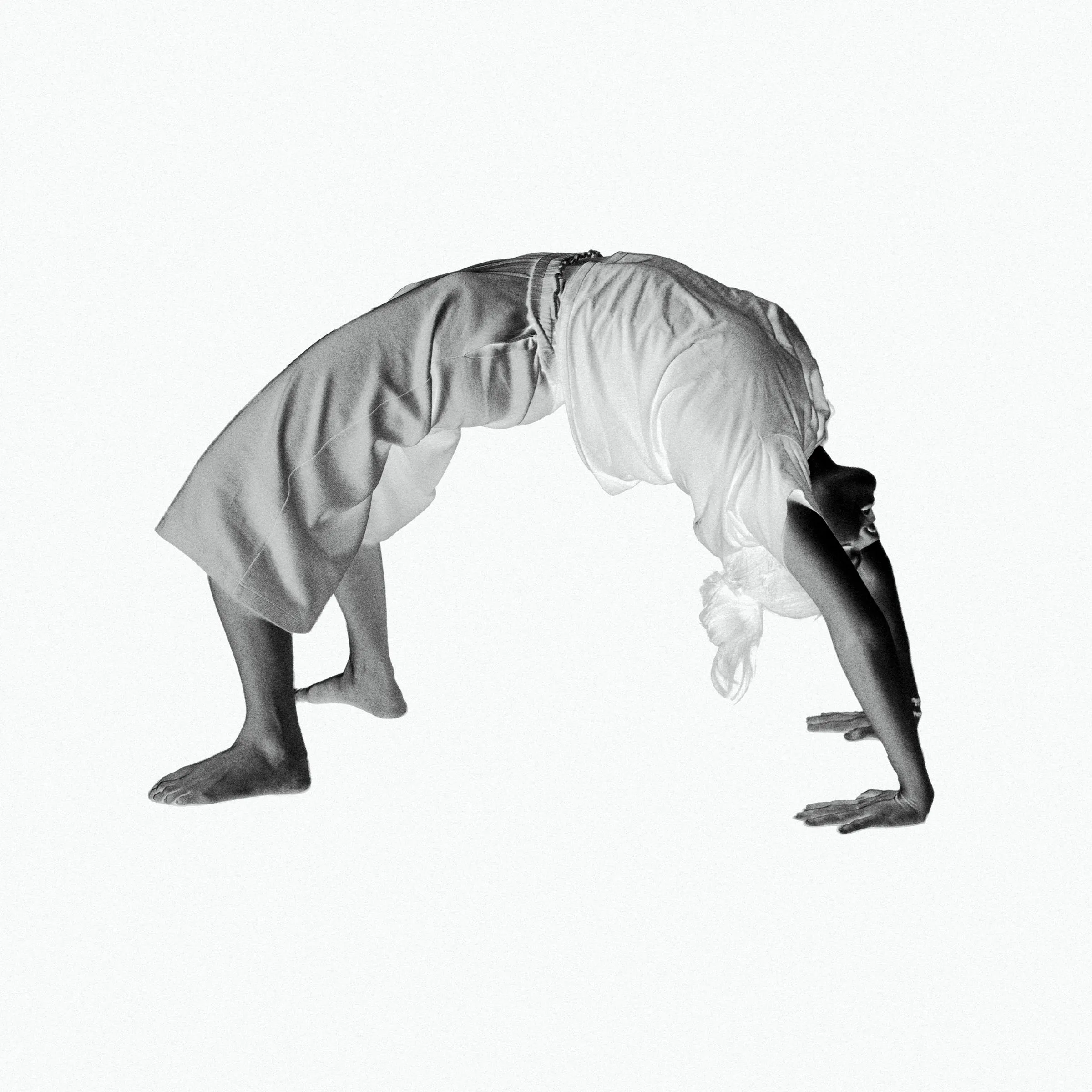
Project Type Film poster and titles Client Empty Square, Yannis Beretsos Description The film is about the never-ending pursuit of self-identity. It follows the daily life of the young character who seems to be lost among different states. ● Inspired by the dark collage work of the Polish artist Zofia Kulik, the black poster features the main character's body dispersed in an optical illusion-like geometric pattern. From a distance, the artwork appears to be just that, but upon closer inspection, the various poses of the human figures and their potential parallel identities are revealed.
1


Project Type Poster Description The custom lettering and cross-like form are inspired by the quirks and details of the Byzantine alphabet, intermixed with the simple shapes of Akzidenz-Grotesk, to support the concept of re-genesis that the movie suggests. ● The poster itself was heretically produced by embracing the grotesque accidents of the printing method when combined with the selected heavily textured semi-transparent, cream-coloured, Italian paper.
1


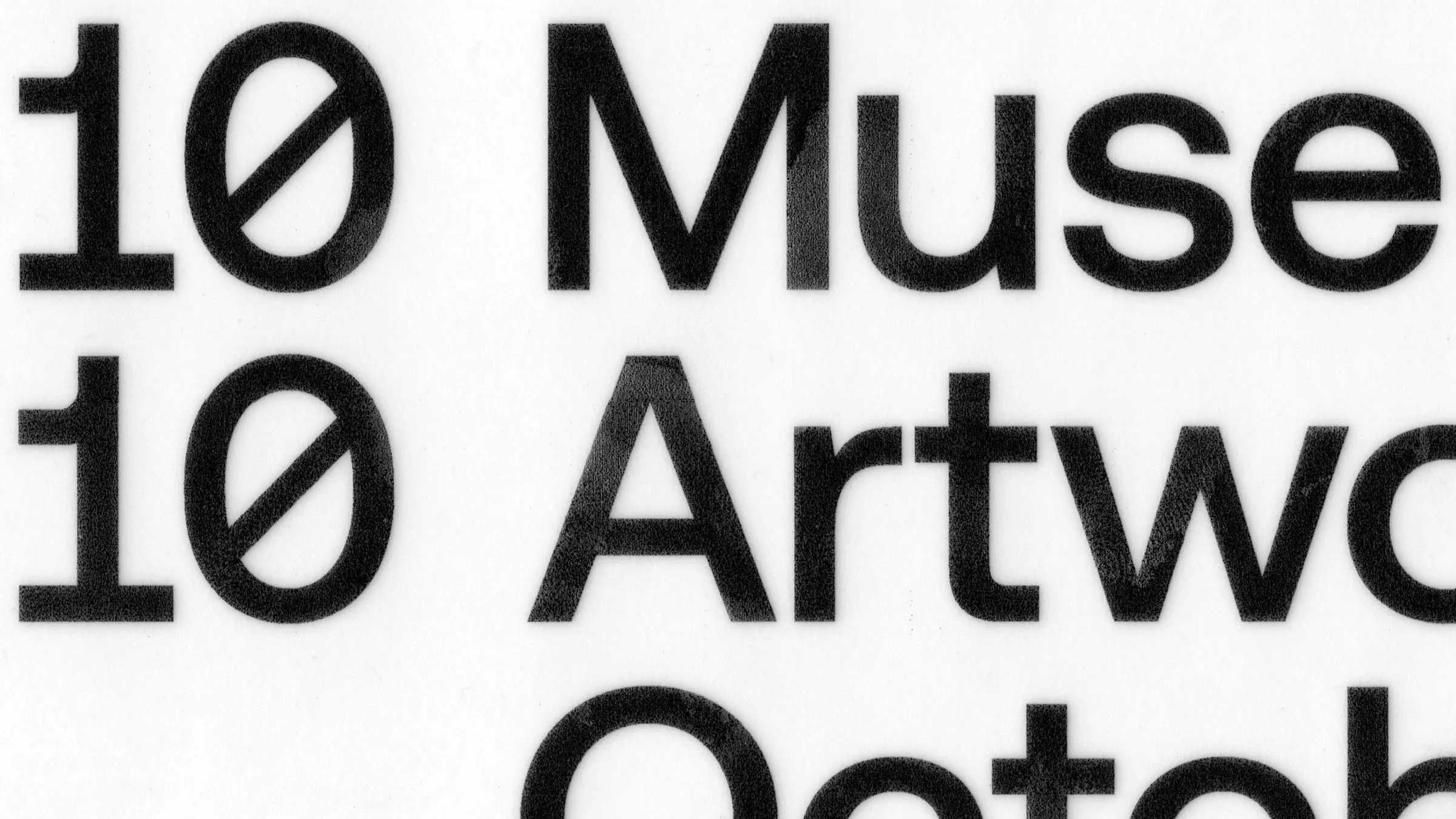
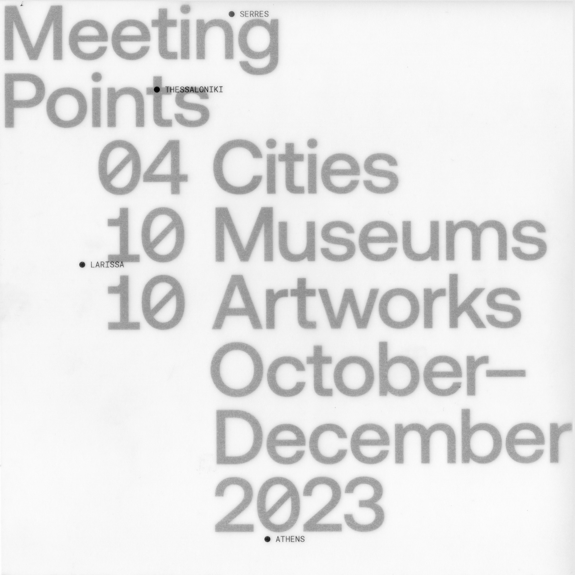
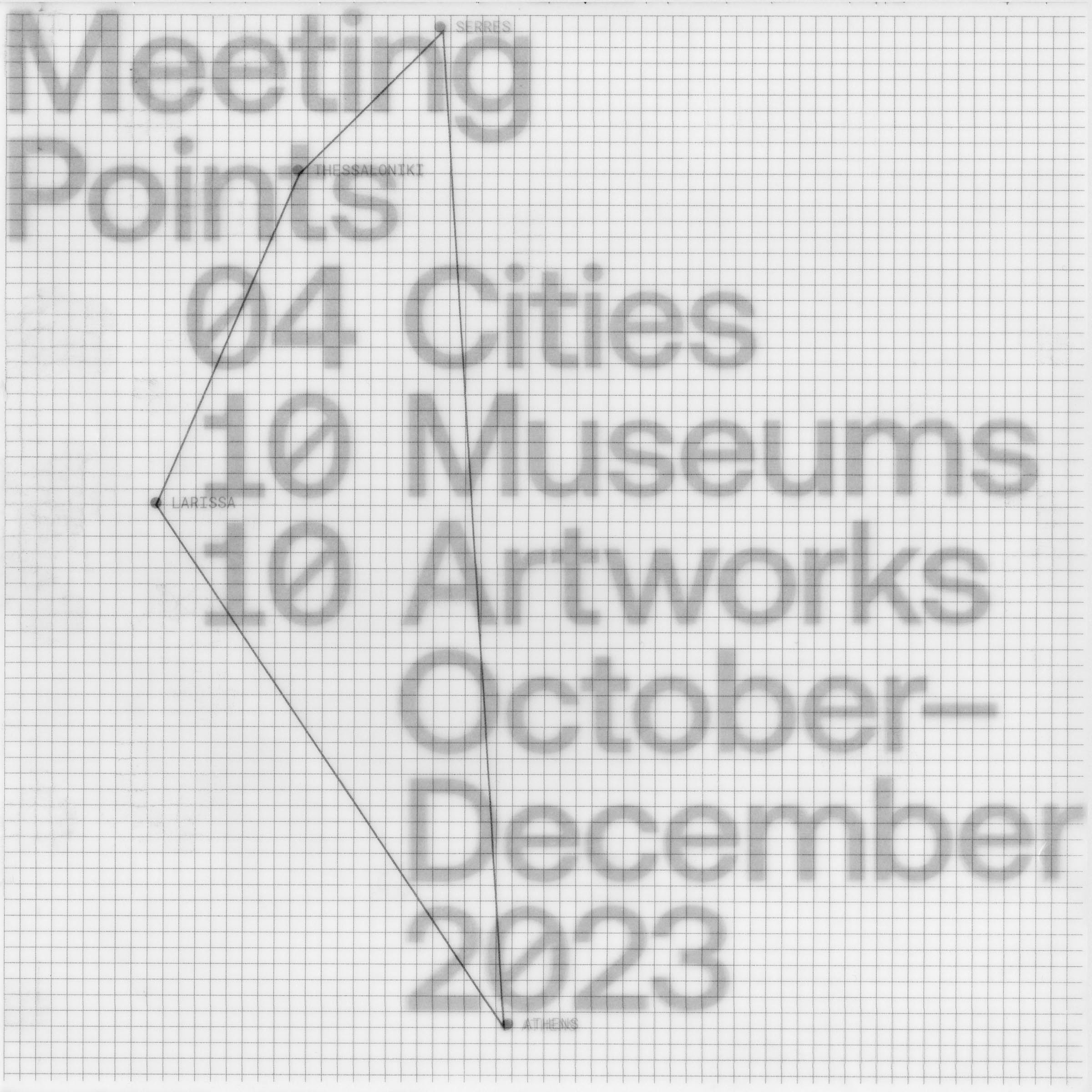
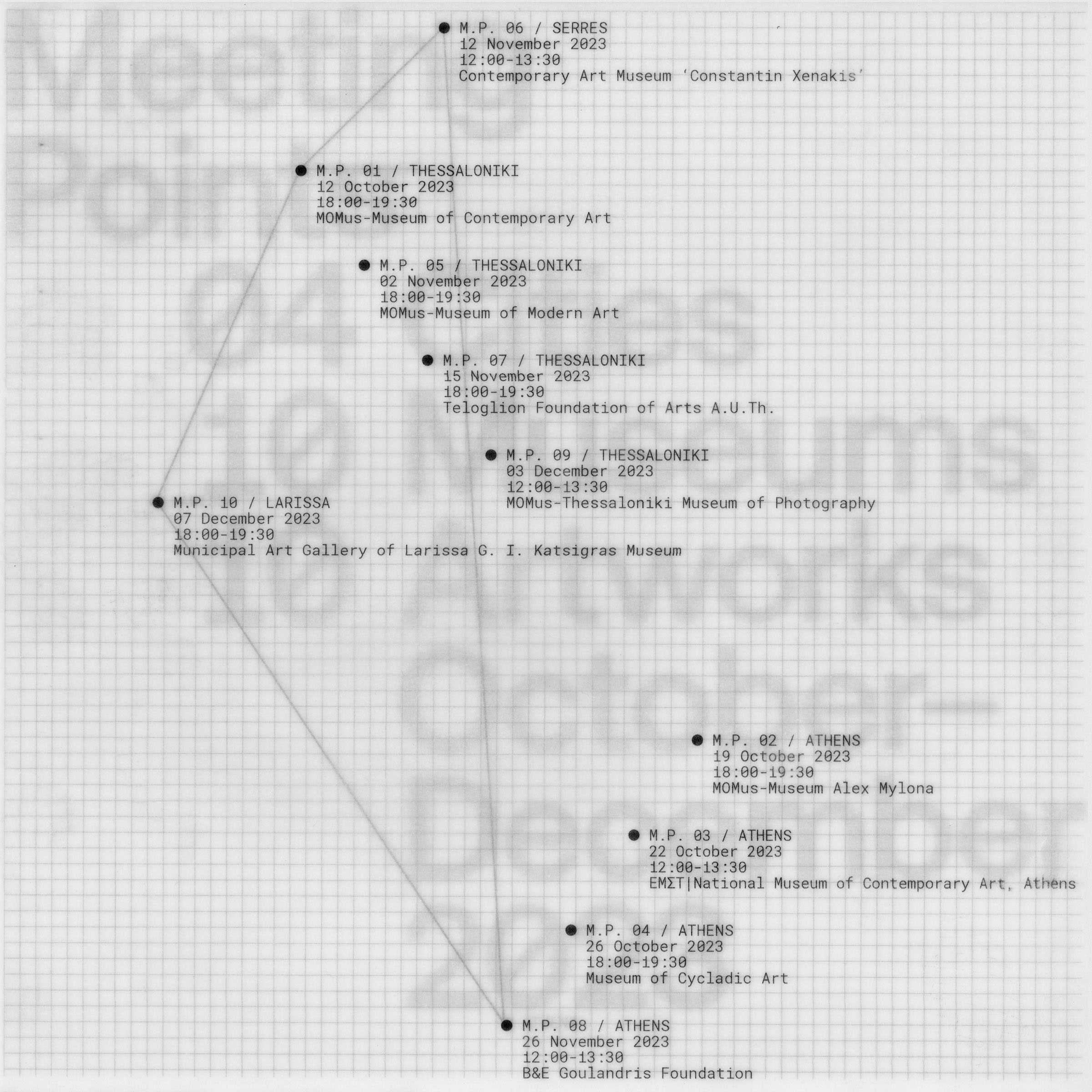
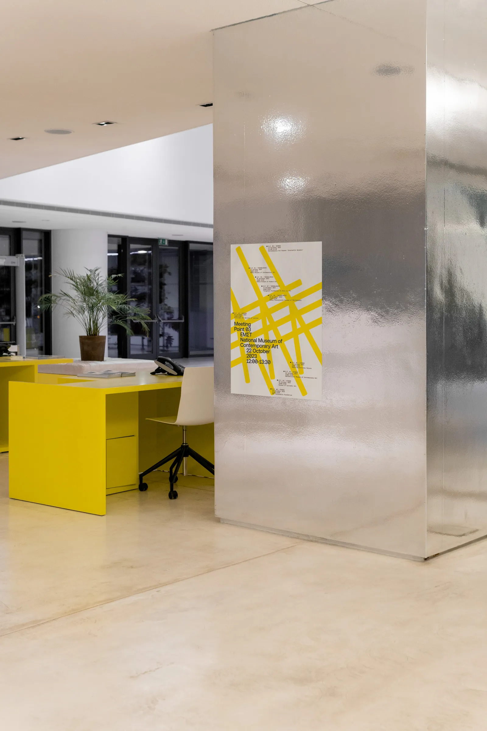
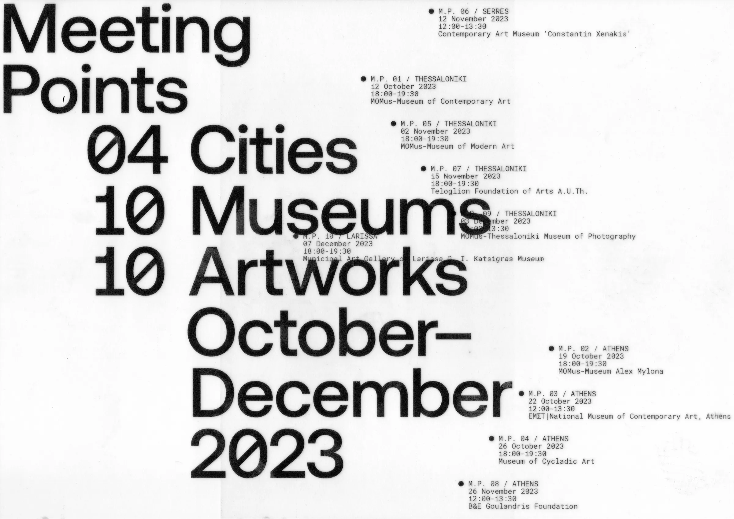
Collaborators Mariza Tsakona Project Type Event identity Client Offsteam Description From October to December 2023, 10 museums in 04 cities across Greece were transformed into Meeting Points for inclusion and co-creation as part of this Off-Stream project. This action brought together organizations, museums, and participants to emphasize that everyone deserves the opportunity to experience art, offering participating museums the chance to expand their collections’ accessibility. ● These Meeting Points, the independent organizations, the 120+ participants of the experimental workshops at the 10 museums, and the 10 selected artworks are being interconnected on the poster’s 2D plane utilizing the concept of an invisible map. The events are displayed in topological rather than chronological order. The background represents the reason for the meeting, the artwork, which is given a new dimension - inclusive and relevant to all - through the participatory process of creative audio description by both sighted and non-sighted individuals. ● Initially presented as a solid, simple, two-dimensional entity, the artwork undergoes a metamorphosis during the meeting, evolving into a detailed image in the minds of attendees and those who will later explore it through hearing or reading. Each meeting is equally accessible to adult individuals with and without disabilities, with simultaneous interpretation in Greek sign language and the use of tactile aids. Credits Meeting Points Photography ©Hichem Merouche Awards EBGE Greek Communication Design Awards: Poster series (Finalist)
1


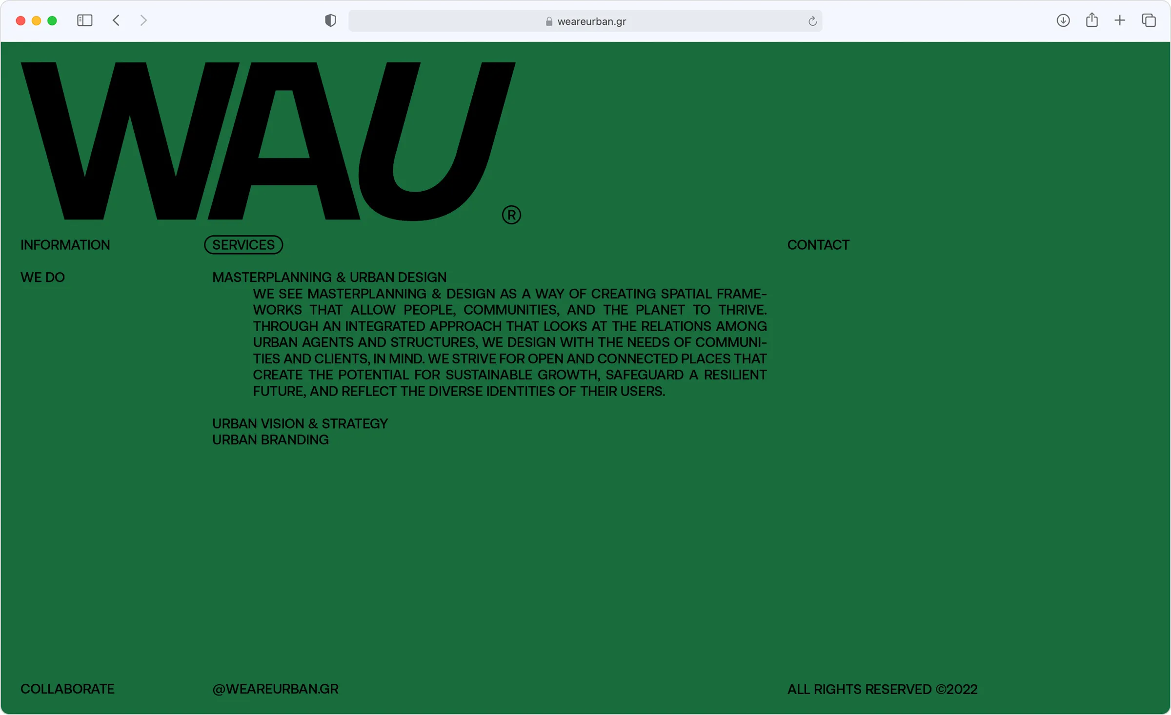
Creative Direction Georgia Harizani, Dimitris Lelakis Collaborators Georgia Harizani Project Type Visual identity system Client We Are Urban Description WAU is a specialized urban design consultancy with international experience, adept at shaping cities, and public spaces. They collaborate with municipalities, developers, and communities to create positive urban transformations. ● The visual language created, utilizes a customized wordmark transcending into a system of values and information, that is implemented in various digital and analog, fictitious or real formats.
1


Collaborators Myra Bizimi, Athanasios Katsougiannis Project Type Poster Client Vakalo Art and Design College Description The WIP Exhibition poster was created for an exhibition showcasing the mid-semester work-in-progress projects of the visual communication design program students at Vakalo Art and Design College in Athens, Greece. ● By embracing the transitional, in-between nature of these projects, the poster features an assemblage of student-created letters on one side, while on the other, provides additional information about the projects displayed at the exhibition, acting both as promotional material and informative memorabilia.
1


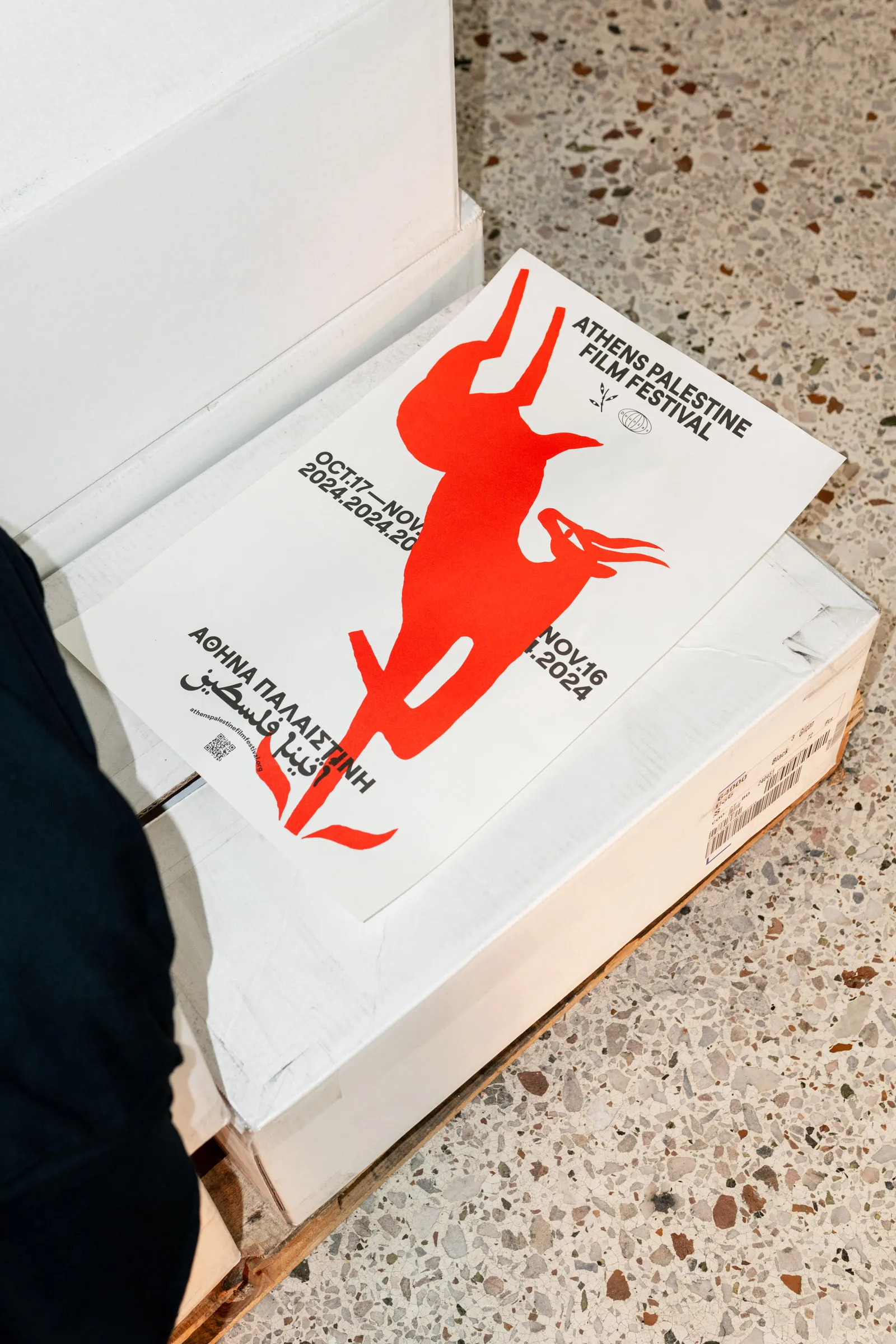
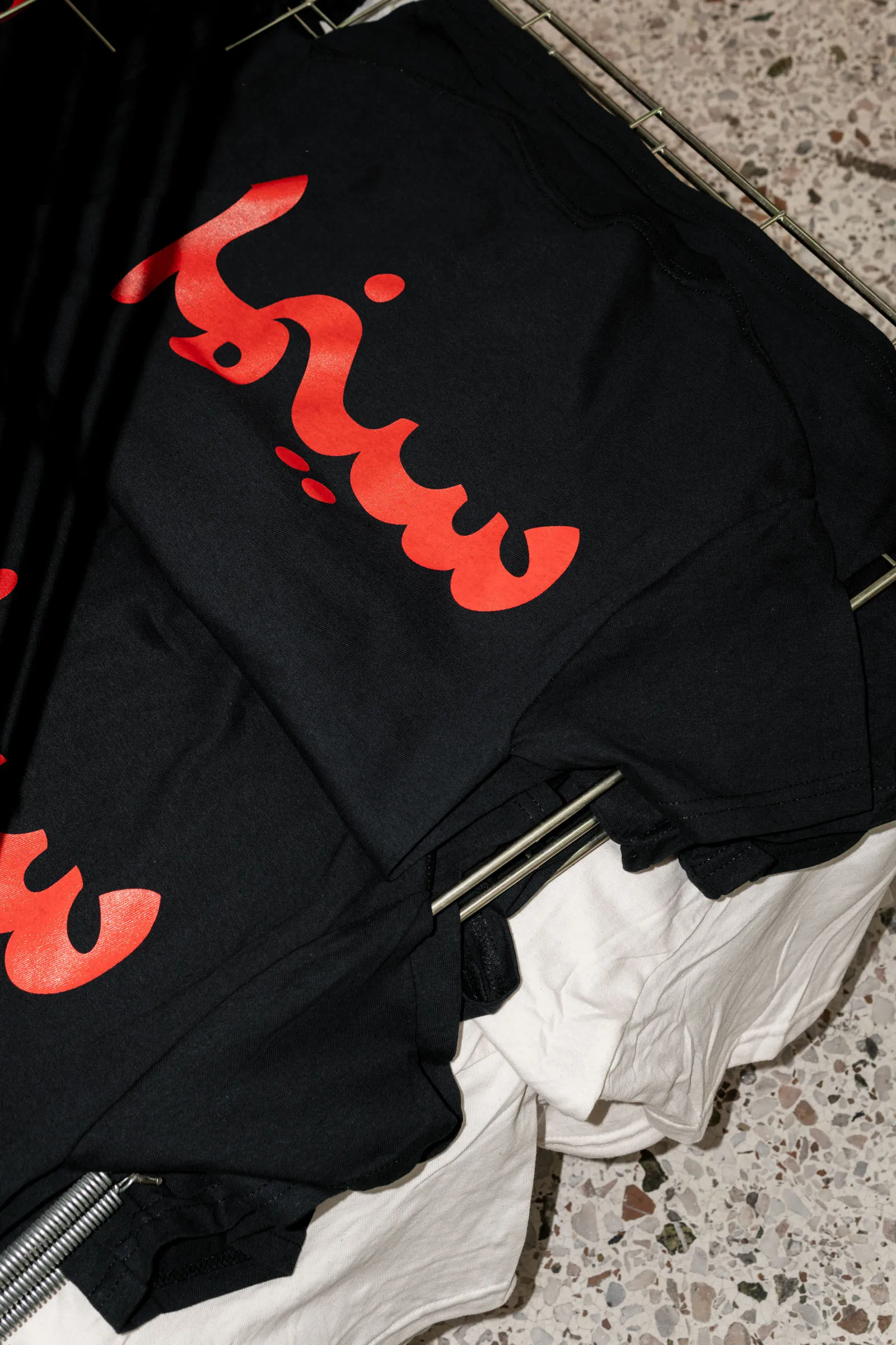
Collaborators Temporal-Practice with Juan Solano, Sofia Korfiati Project Type Visual identity Client Dounias NGO Description For a brief moment, the city of Athens was filled with bright red gazelles. The gazelle, a timeless emblem of Palestine, stands as a symbol of its people—steadfast, beautiful, and free, despite the trials of history. It embodies the soul of this year’s festival, where each film is a leap of courage, a whisper of hope, and a defiant testament to the enduring connection to the land. Like the gazelle, people's stories transcend borders, capturing the tenderness of love, the power of memory, and the strength of resistance. Through art, we reclaim our place in the world, leaping forward, unbroken. Awards Greek Communication Design Awards: Poster (Award)
1


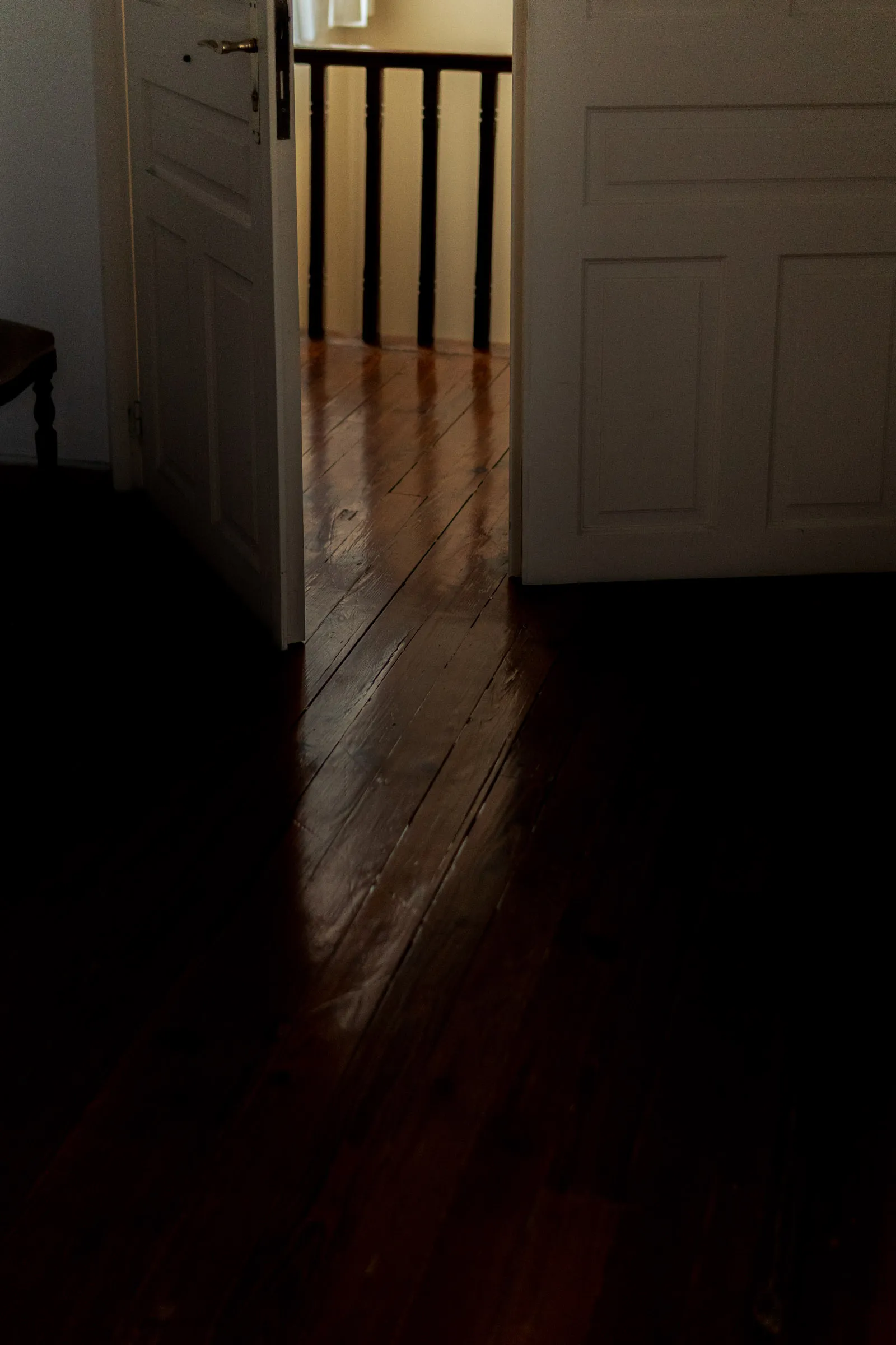
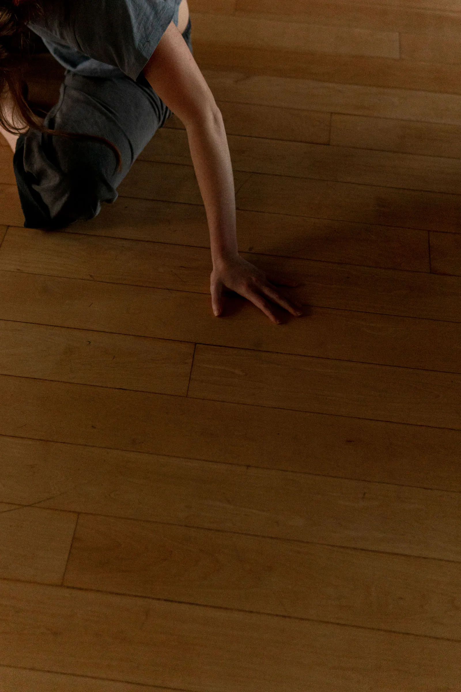
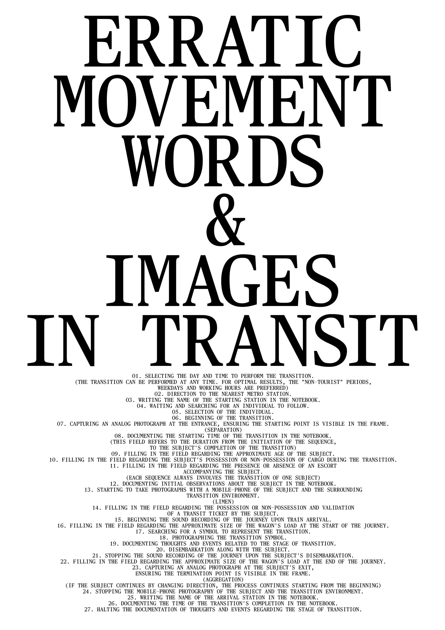
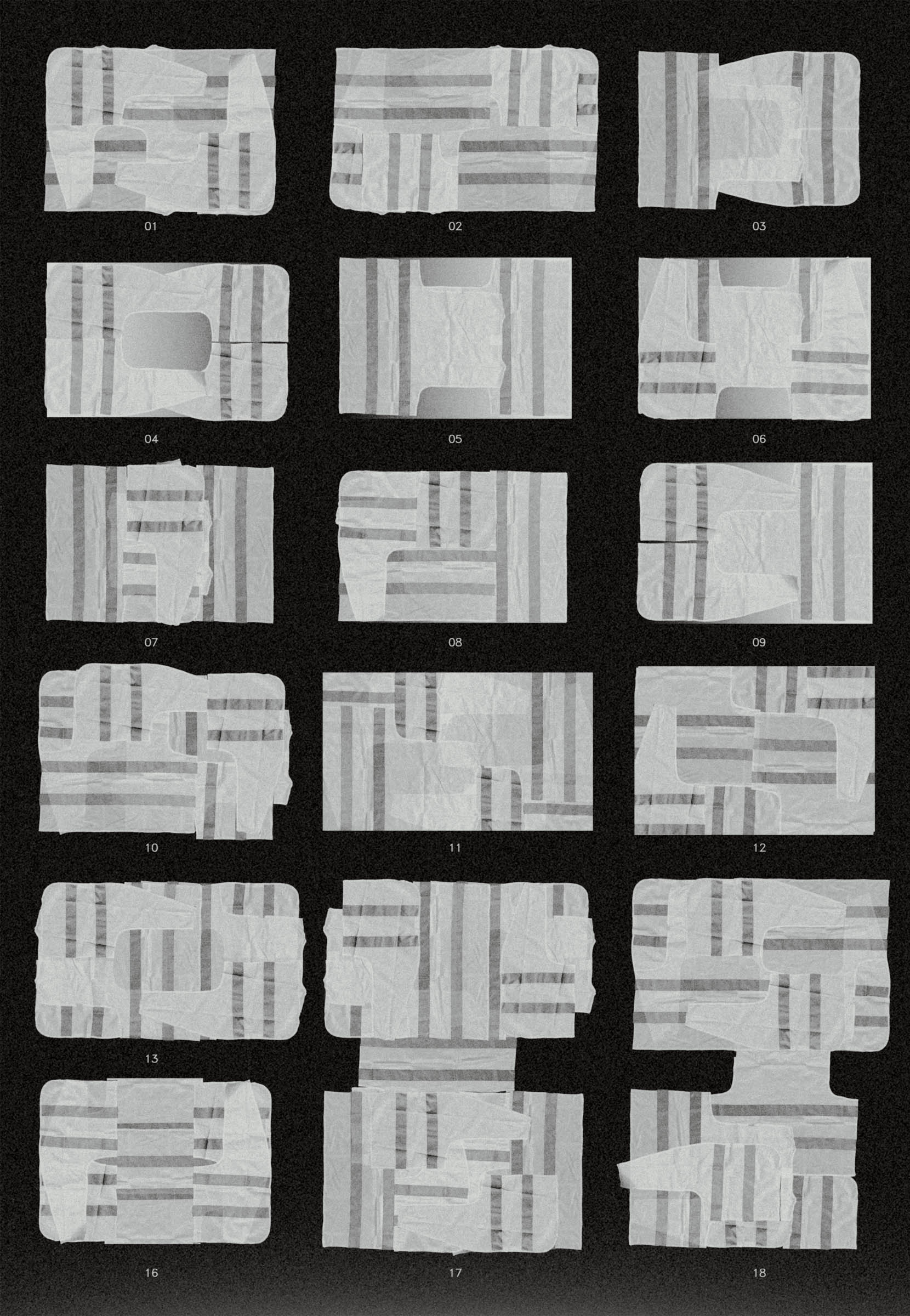
Project Type Research, Publication Description The everyday condition is characterised by speed and lack of directional control. In line with the theorist Tony Fry's assertion that "design designs," the built environment, transportation systems, and man-made - material and non-material structures - define the movement within the world, limiting potentialities and exposure of human experience to randomness. "The subject is trapped in a current that almost doesn't require it to swim," Georg Simmel writes. ● Through the systematic study of everyday movement, the project seeks to emerge, preserve and enhance the dialectic between human existence and the space of everyday. These spaces, which belong to the in-between zone - between destinations -, tend to get lost along with their potentialities as part of the everyday, under the veil of the fast moving, indifferent and boring familiar. ● A synthesis of seemingly random fragments - of materials and time - come into contact, with the aim of changing the perspective of interacting with the familiar, by exploring its poetic dimension and the relationships that arise during its conscious inhabitation.
1


Creative Direction Post-Spectacular Office Project Type Visual identity Client Ministry of the Environment & Energy of Greece Description "Boulevard de la Société des Nations": Greece's participation at the 2021 Venice Biennale was centered around the Aristotle Axis, a distinctive multicultural landmark of Thessaloniki. Designed between 1918 and 1921 by Ernest Hébrard, the Aristotle Axis in Thessaloniki embodies European urban design thoughtfully tailored to the local dynamics of cultural unity between both locals and refugees. Today, the Aristotle Axis serves as a vibrant meeting point, a place for cultural activities, human assemblies, parades, and protests. ● In the Greek Pavilion, a graphic installation comprising hundreds of booklets-pixels arranged and displayed on special wooden structures, portrayed the historical narrative and everyday life. Each visitor could participate by removing pixels and taking away fragments of the Axis's journey, unveiling a multilayered history. The project was created under the direction, with and for Post-Spectacular Office.
1
Image©: Ugo Carmeni


Collaborators Maria Tsilomitrou Project Type Research, Publication Description In recent years, there are numerous opportunities for the active participation of users in the design process. In this project, we studied how a variable system can meet the fundamental needs of users, while involving them in the process of designing the space that surrounds them. ● We observed the daily actions of people and the objects they use in both private and public environments. We analyzed the physical heights at which these actions occur, and developed structures on a 1:1 scale, which, after being multiplied by specific constants, result in 3 levels of actions. These levels include those of the seat, the desk-table, and the eye. The basic structure of the system is based on a singular neutral unit. The system can adapt to diverse situations, by incorporating different modules that change its use. These modules collectively form the users' toolbox. This toolbox can be expanded by adding new elements. ● The graphic design part of the system shares the same design language and grids with the structures. This system grows and evolves together with the person, whose experiences and habits are directly related to the layout and functions of the resulting structures. We created examples of such structures and gave them various functions using the toolbox and everyday objects. ● The project was completed with the design of a book-manual containing the construction and graphic design elements of this work, as well as photographic material of the structures that were designed and built to satisfy possible imaginary everyday scenarios. Awards Greek Communication Design Awards: Experimental project (Finalist)
1


Collaborators Maria Tsilomitrou Project Type Modular type Description Unified mono is a typeface project closely related to a modular system of objects. It is the 2-dimensional part of the project "Unified System: Structures of Variable Use''. The monospaced font draws inspiration from the principles of constructing three-dimensional wooden structures, like joinery and the study of statical forces. The letters were treated as units and the words as structures. Evolving at the same time, both projects (the physical and the non-physical) influenced the form of each other in an effort to blend the materiality and craftsmanship of the wooden structures with the style of the 2-dimensional characters. Awards Greek Communication Design Awards: Experimental project (Finalist)
1


Collaborators Mariza Tsakona Project Type Exhibition identity Client Offsteam Description Offstream is an inclusion-focused initiative that helps organizations make contemporary art and culture accessible. In our ongoing collaboration, we help them create identities for their projects that offer a great chance of being inclusive through their visual simplicity. Those projects range from tactile representations of art, wayfinding systems, visual identities for talks around inclusion practices, accessible museum exhibitions, online workshops, and braille printed matter.
1

Project Type Publication Description As an archaeologist of my memories, I bury my favourite tree in 20 blocks of 500 pages. 10000 Pages in total, since according to Google, that's how many are produced from the guts of a standard mature tree. The tree’s memory is fragmented and then dispersed throughout the pages of each volume, providing the reader with a progressively clearer impression as they flip through them. ● To help browsing the pages, a special, brass thickness-measuring device, serves as an indexing tool for the prospective archaeologist.
1


Project Type Publication Description Working Flag acts as a representation of those who don't belong, who are tired of belonging, or have chosen to reject belonging altogether. Unlike a traditional flag, this imperfect construction uses a desynthesized, cheap fluorescent hazard-vest as its main material, which, when re-sewn together, morphs into a symbol of uncertainty—an indication of the under-construction and of impermanence. ● By following the instructions, the prospective flag bearer can sew their own version of the Lavalier, embodying their personal journey of transcendence and transformation.
1


Creative Direction Post-Spectacular Office Project Type Animation Client Design Democracy Description 3D animation and concept implementation for Design Democracy, an unreleased cultural festival. The Design Democracy manifesto is written on a loudspeaker made of paper designed by the P-SO architectural team. The direction of the text is flowing towards the loudspeakers' output, nodding to those used for peaceful demonstrations.
1


Project Type Object Description A visual note on time's unidirectional flow. An action influencing the next. An indication of progress or a sign of decline. On the bright side, at each turn, an opportunity arises, to start from the beginning. A sign to initiate change.
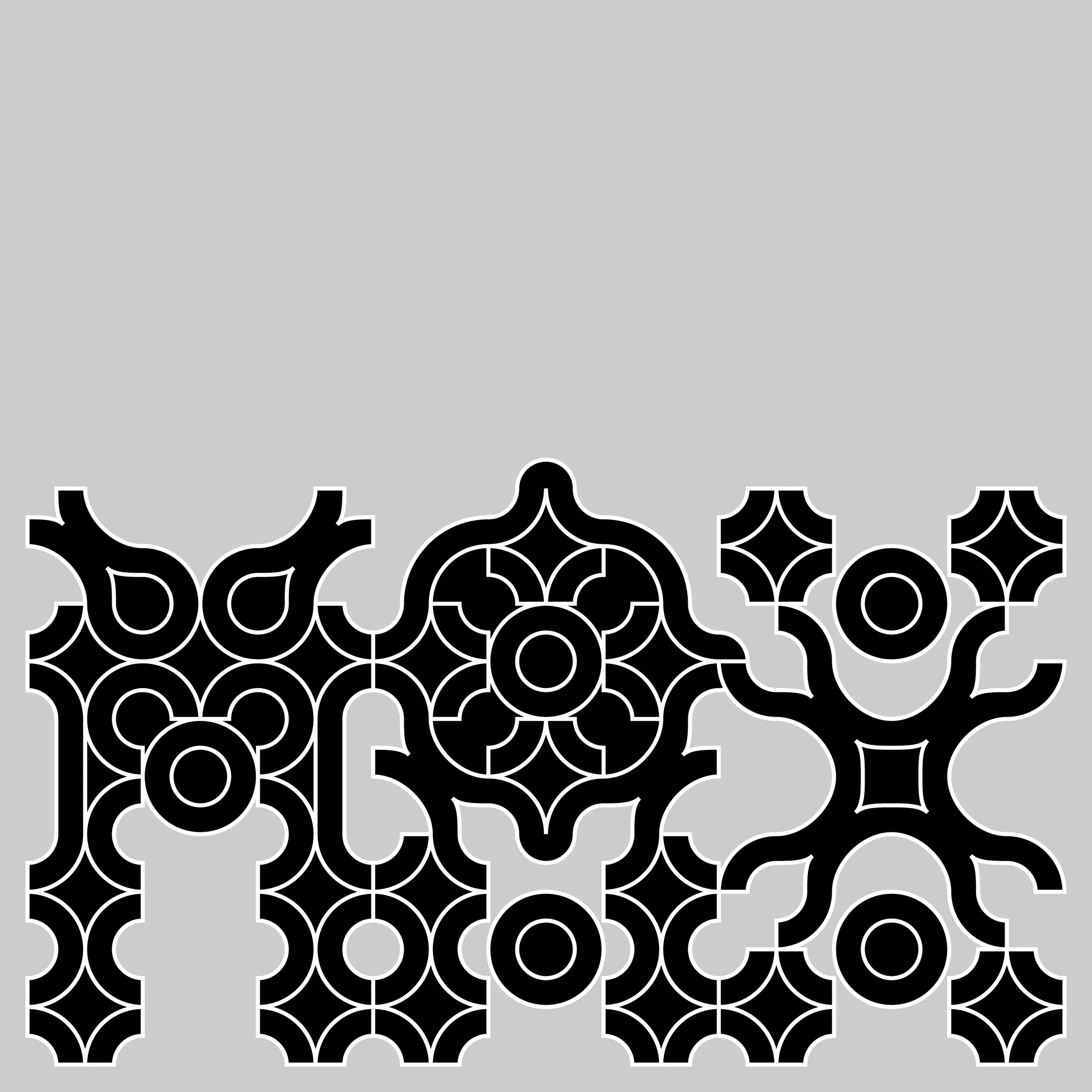
Project Type Modular Type System Description The form of this custom modular typography draws inspiration from exaggerated Byzantine capital initials featured in old books, detailed painted floral patterns, intricate handmade tiles, and colorful geometrically shaped stained glass. ● The typographic system uses five simple initial geometric shapes to form interconnecting compositions that oscillate between expressiveness and legibility. The concept was produced during a modular type design workshop organized by George Tsavalos
1


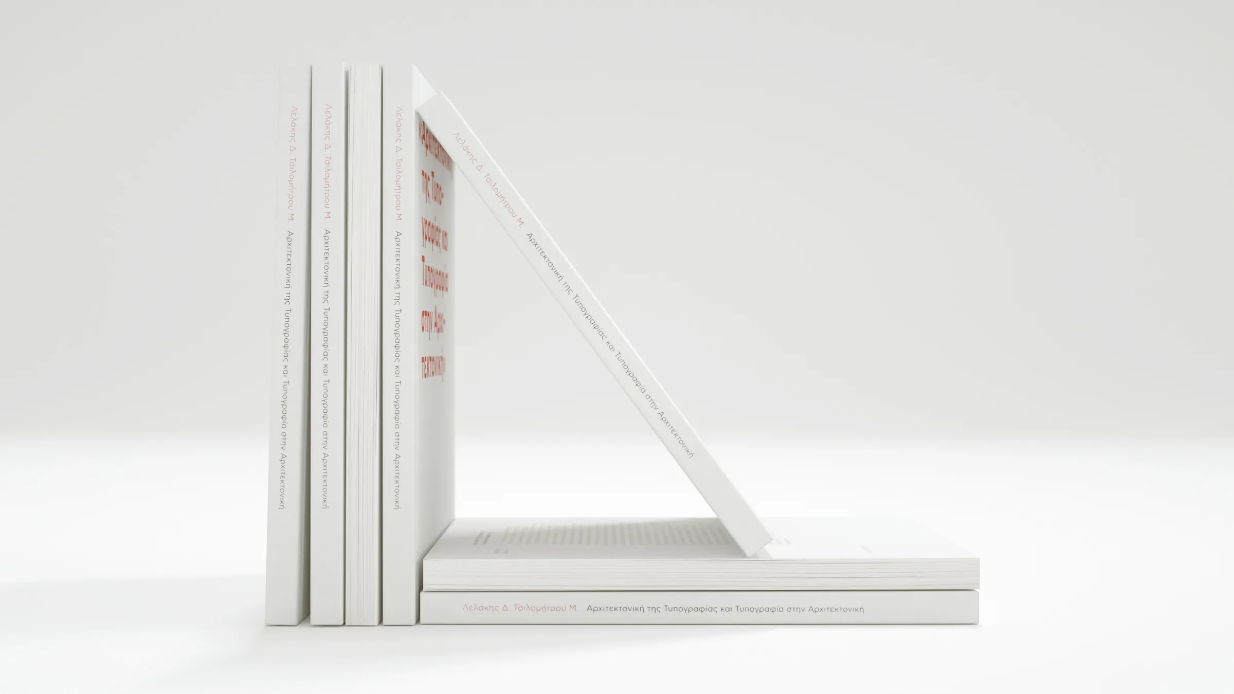
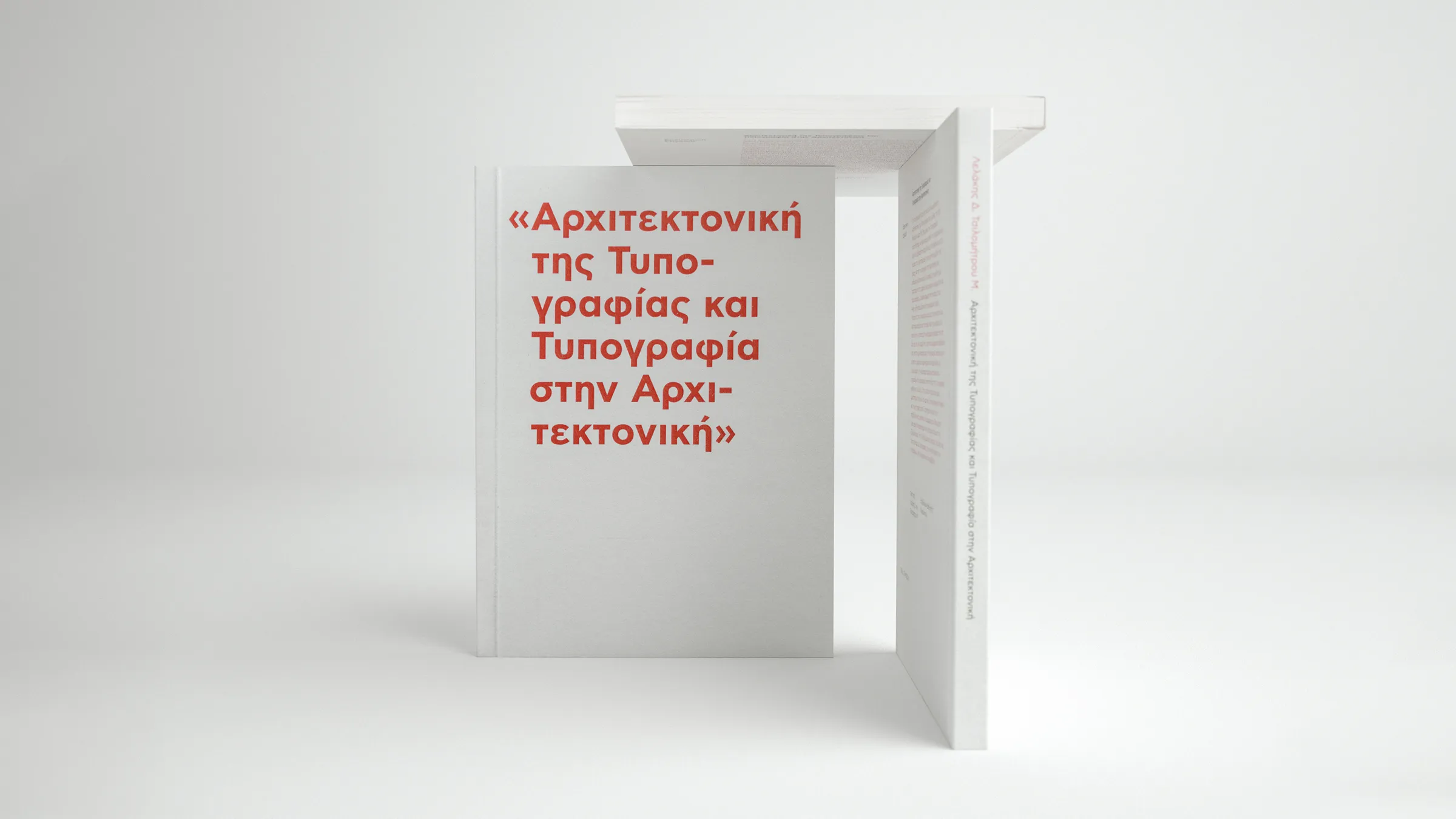
Collaborators Maria Tsilomitrou Project Type Research, Publication Description This study analyzes the relationship between typography and space. After dissecting typography's anatomy and explaining it in basic terms, the research focused on exploring its impact on the built environment and human behavior.
1


Project Type Interior design, Object design, Visual Identity Description CW is a holistic study of an architectural system and a visual language built around a flexible hair-treatment practice, that balances daily utility and quirky aesthetics.
1


Project Type Motion Design client Dimitria Festival art Direction + Design Post-Spectacular Office Description A motion design system that builds on and expands an existing brand identity for the 57th Dimitria, an annual cultural and music-related festival.
Collaborators Maria Tsilomitrou Project Type Poster Client Museum of Typography Description Like a window in our world, the word typography is being repeated and then projected on a marble wall, shaping the light that is coming through, bringing typography into our world for a moment. Blending and using analog and digital mediums we wanted to show how type can transform everything around us. Awards Museum of Typography: International poster competition (1st place award)
1


project coordination Post-Spectacular Office Project Type Collaborative publication Client Goethe Institut Description Pixels is a collective publication involving 12 artists and 12 corresponding designers. Within a shared framework of guidelines, each designer had the challenge to design a booklet, inspired by the works of a specific artist. The process of selecting these diverse designers and pairing them with individual artists was made in a way that would highlight the open and continuous creative dialogue shared between them. Awards Greek Communication Design Awards: Artists' catalogue (Finalist)
1
Project Type Various Description A curated archive of assorted projects. A non-collection containing artifacts of experiments, research, parts of published and unpublished work, and collaborations. That includes motion graphics, type design, posters, photography, objects, systems, implimentations.
1


Creative Direction: P-SO

Creative Direction: P-SO

Image©: Constantine Stamatis

Creative Direction: P-SO

Creative Direction: P-SO
Creative Direction: P-SO

Creative Direction: P-SO
